2022
2021
Pinpoint →
Independent – Product design
Fulfillment Configuration →
Cimpress – Product design & UX research
2020
Jetlag.exe →
Independent – Graphic design
Custom Quotes →
Cimpress – Product design
2019
Meals on Tour →
EF Education First – Product design
2018
JumboSocial →
Independent – Product design
2017
Karpuul →
Tufts University – Product design & UX research
Updated May 2021
Pinpoint
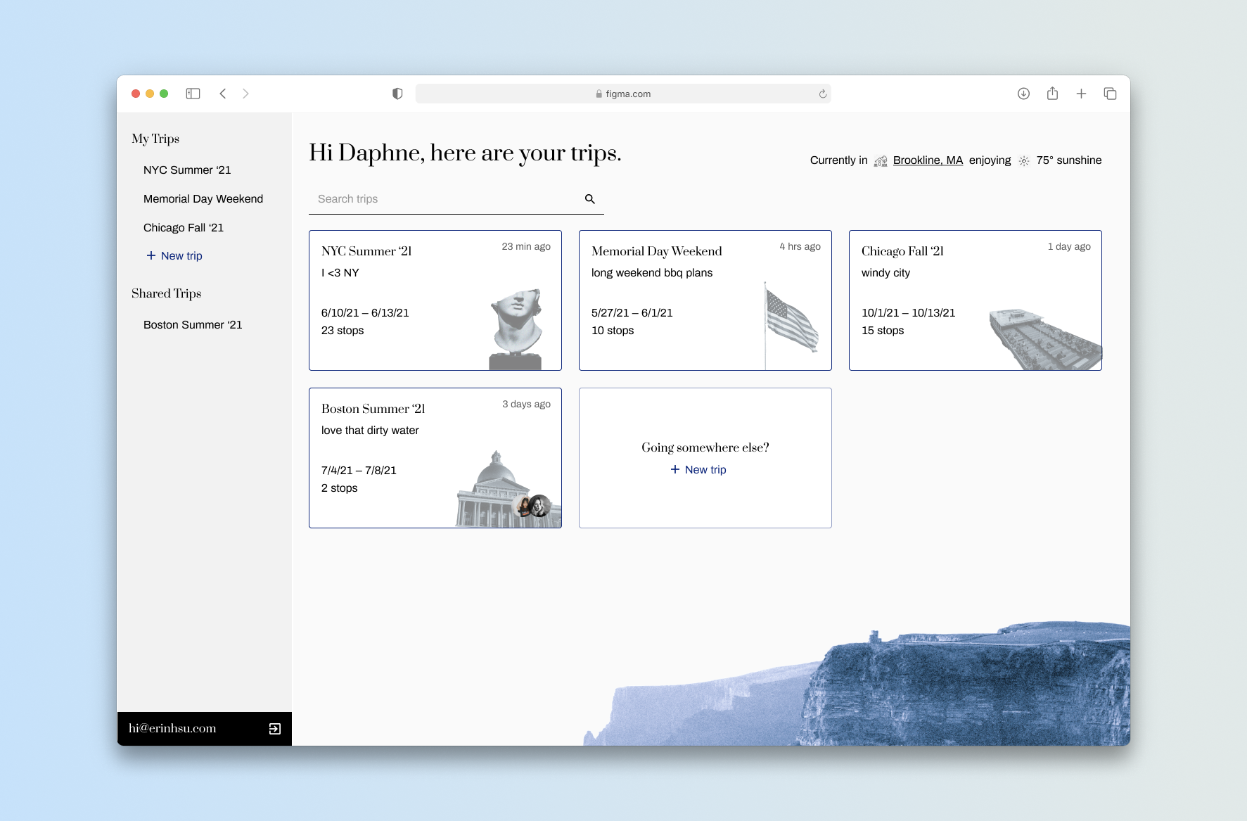
2 weeks | Figma, Miro, Adobe PhotoshopThe idea for Pinpoint came from the frequent frustration of planning out a trip.
The current process involves switching between multiple tabs and managing a mess of links and relevant information.
I designed Pinpoint to create a specific, centralized solution for a common problem, with more opportunity to add features that would directly benefit the travel experience.
Problem
While there are many tools out there to help organize information, there are none that are specifically built to handle planning a trip.
I’ve watched friends use a variety of Notion, Excel, and Google Docs/Sheets, while switching to and from TripAdvisor (for recommended activities), Yelp (for recommended food), and Maps to plot out the most reasonable routes, keep note of business hours, and understand transportation options. All in all, that’s a frustrating amount of mental load involved.
To get a broader idea of what features users would want, I interviewed a friends who are frequent travelers. I then took mentioned features and needs and considered how they would work as one application.
![]()
![]()
After that, I zeroed in on the user flow for creating a new trip from the homepage.
![]()
Low Fidelity
Lo-fi wires were created in Miro, in order to visualise the layout and how a user would move through creating a new trip.
![]()
It made sense for the creation step to handle naming the trip, the dates, and where the first destination would be. Then, the user would land in the heavier itinerary management page.
When planning a trip, most people organize by day. Users have a mental model of planning out activities in the most cohesive manner geographically – travel time and an overview of where places are in relation to one another were therefore important.
![]()
Operating off the assumption that the user wouldn’t be extremely familiar with the area, it makes sense to allow users to move the stops around. Business hours, holidays, and a better picture of locations will also impact how stops are ordered.
Another feature that was said to be useful is the ability to have a packing list, particularly when sharing a trip with friends.
![]()
While there are many tools out there to help organize information, there are none that are specifically built to handle planning a trip.
I’ve watched friends use a variety of Notion, Excel, and Google Docs/Sheets, while switching to and from TripAdvisor (for recommended activities), Yelp (for recommended food), and Maps to plot out the most reasonable routes, keep note of business hours, and understand transportation options. All in all, that’s a frustrating amount of mental load involved.
To get a broader idea of what features users would want, I interviewed a friends who are frequent travelers. I then took mentioned features and needs and considered how they would work as one application.

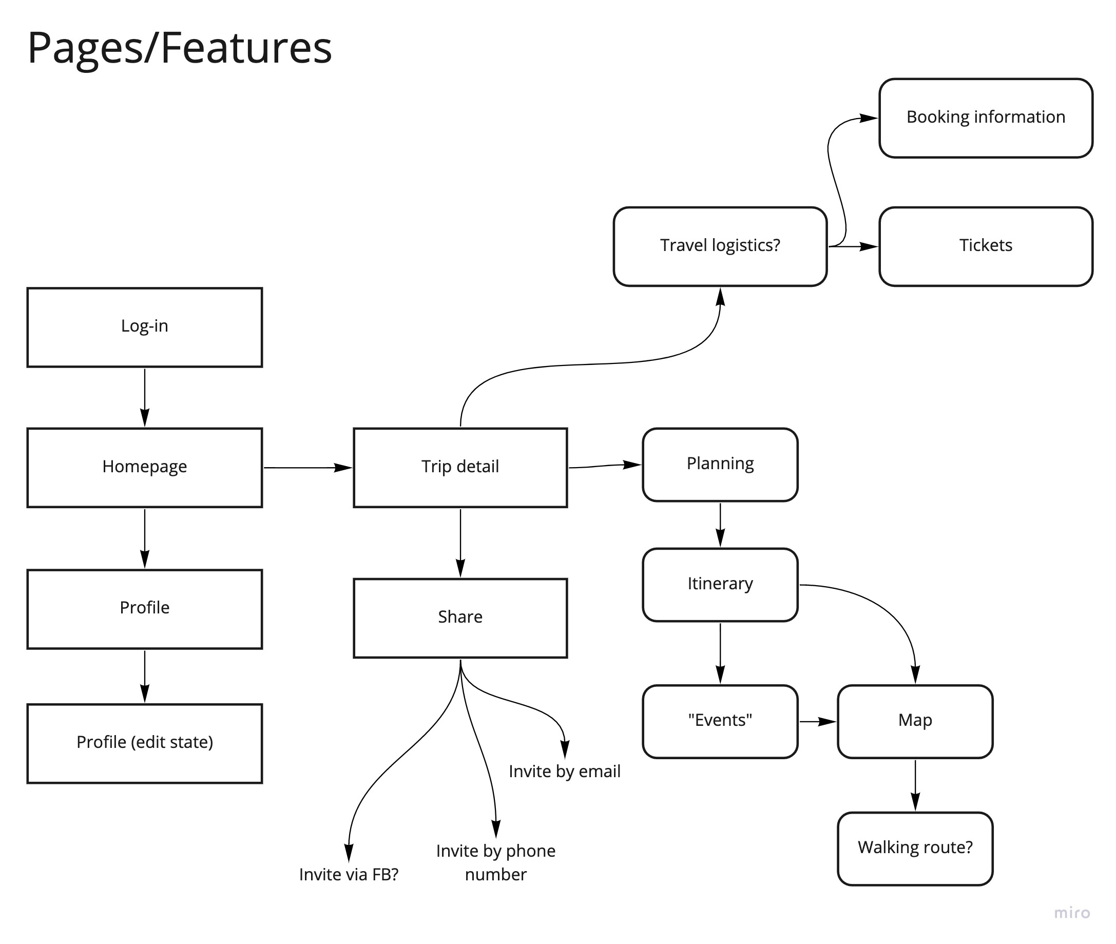
After that, I zeroed in on the user flow for creating a new trip from the homepage.
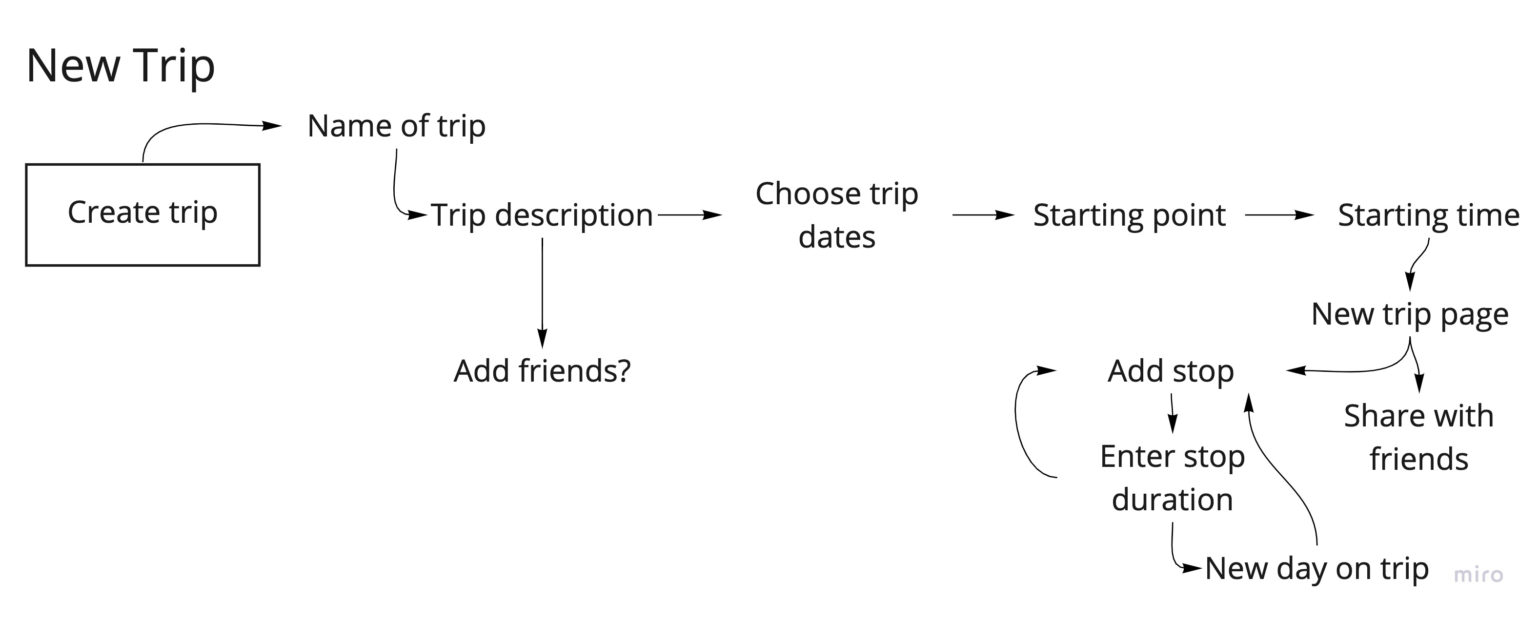
Lo-fi wires were created in Miro, in order to visualise the layout and how a user would move through creating a new trip.

When planning a trip, most people organize by day. Users have a mental model of planning out activities in the most cohesive manner geographically – travel time and an overview of where places are in relation to one another were therefore important.

Another feature that was said to be useful is the ability to have a packing list, particularly when sharing a trip with friends.

Identity Exploration
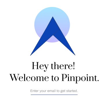
The stylistic identity of the UI changed a lot early on, as I was unsure whether I wanted Pinpoint to be bright and friendly, or sleeker and elegant. Below are some initial explorations in color, font pairings, and branding.


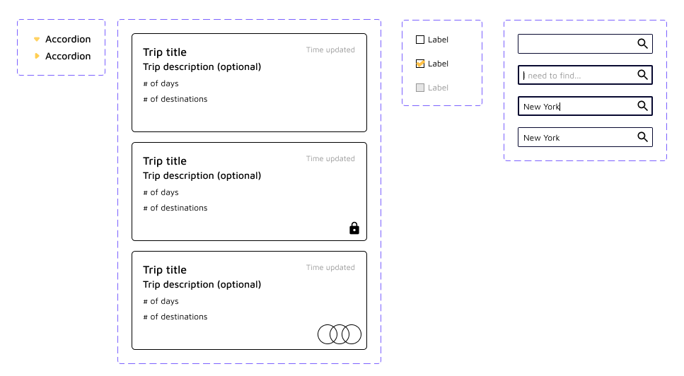
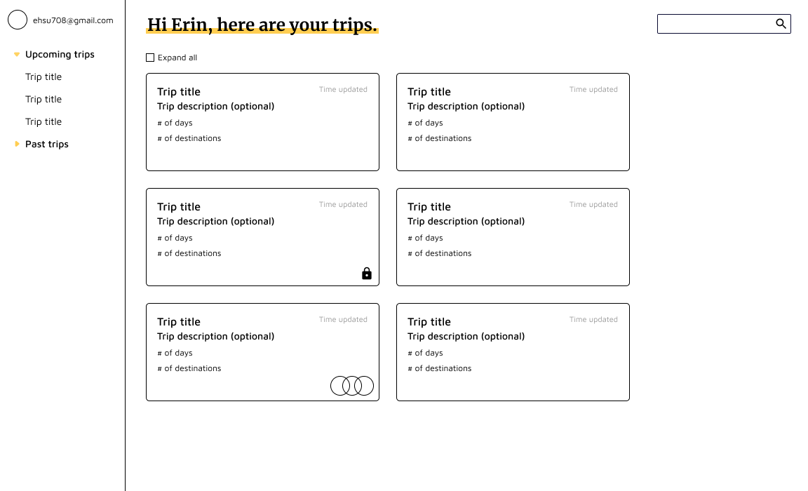
I started off with a couple of components, laying them out following the lo-fi wires – but it felt off, and almost too young for the original intent. This is a trip planner for college students and older, and therefore needed a sleeker, more mature design identity.
High Fidelity
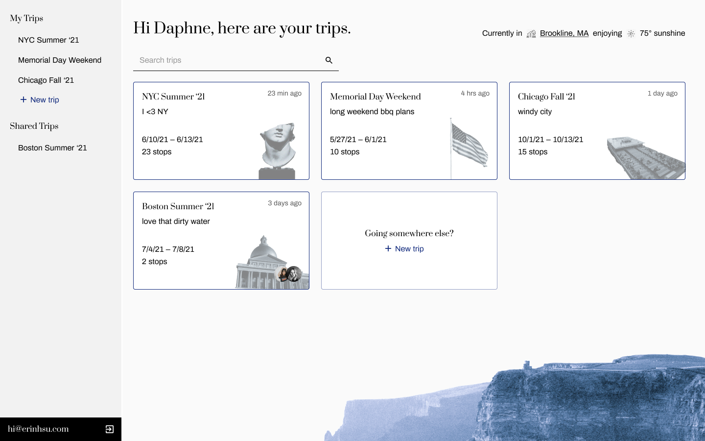
Once I’d settled on a design language, high fidelity wires were built in Figma.
The colors next to each stop mean to communicate the type of stop it is: purple for lodging/hotels, blue for musuems, and red for food.
The colors of the Google Map pins also represent the type of stop, and would utilize the available capabilities of the API. Transportation modes the user can choose from to get from stop to stop would also be similarly pulled.
While the user would be able to enter the duration and when they wanted to be at a stop, the app would help reduce mental load by calculating the travel time for users.

The side menu (collapsible) aims to let users quickly navigate from itinerary planning to the packing list. It also has the potential to hold more features, shown here as ‘Links’ and ‘Map View’ – a potential to store all links to tickets/passes, and a robust visual guide of the itinerary.
Days are stored in accordions so the user can utilize more space to do planning; I wanted to minimize tedious scrolling as much as possible.

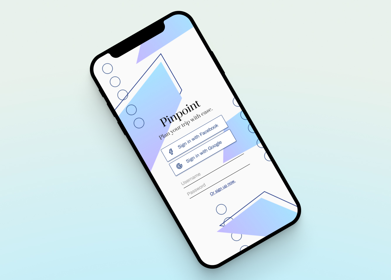
Mobile (Coming Soon)
Fulfillment Configuration
3 months | Sketch, Miro, WhimsicalImpact
Fulfilled self-service initiative OKR (FY2020).
Research used for unified navigation effort OKR (FY2021).
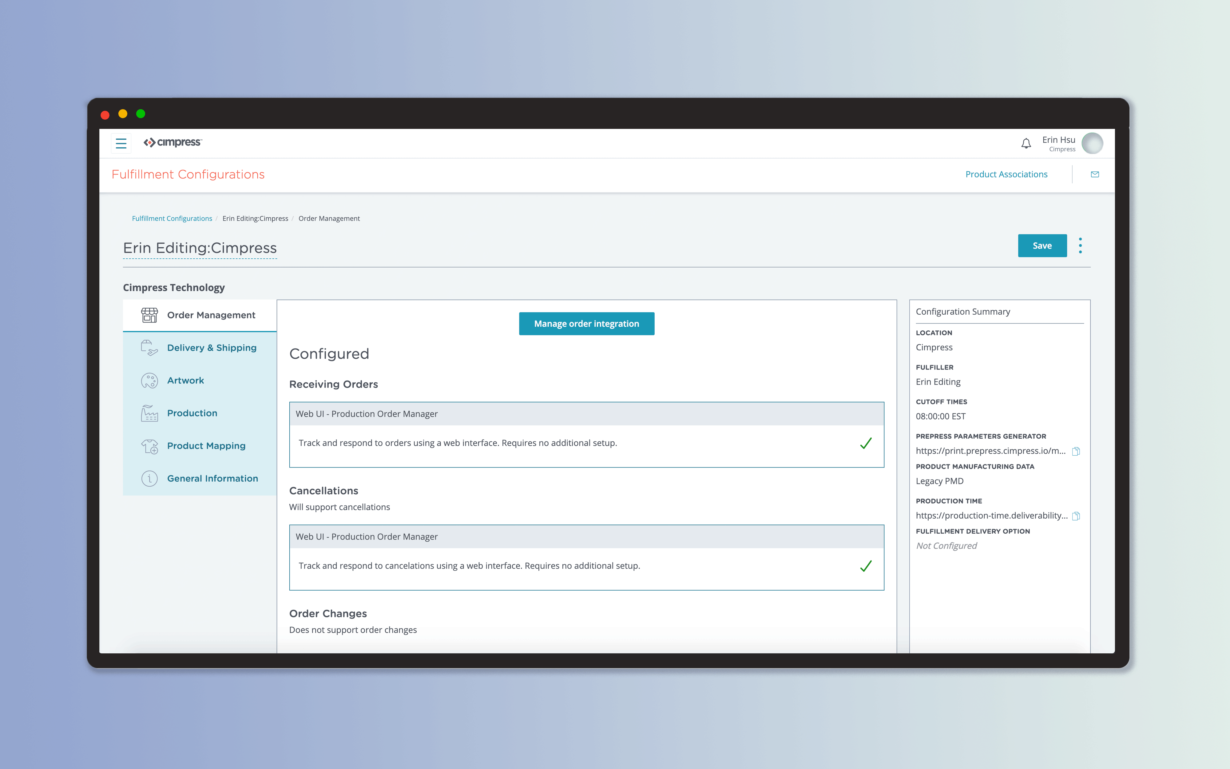
The fulfillment process is crucial to Cimpress’ support of their internal businesses. The overarching goal for the project was to empower users towards a self-service onboarding of fulfillment details.
I led the design for a sleeker fulfillment configuration product, and conducted research to better document the user journey.
This application was a major milestone for the onboarding of one of our largest European fulfillers.
Context
As this project focused on a legacy system, I took time to understand what decisions had been made prior to the current day initiative.
Network managers were struggling to configure fulfillers because they had to jump between 8 different applications. There were a variety of roadblocks that users could run into during this process; alongside the sheer volume of information a user had to manage, the onboarding process was daunting to approach for those less technically savvy.
Frustration with the system was further offset by the importance of ensuring everything was configured correctly: if something went wrong, it would impact the entire order flow and production.
![]()
From the multitude of domain personas, the PM and I identified the main concerns for our primary persona.
As this project focused on a legacy system, I took time to understand what decisions had been made prior to the current day initiative.
Network managers were struggling to configure fulfillers because they had to jump between 8 different applications. There were a variety of roadblocks that users could run into during this process; alongside the sheer volume of information a user had to manage, the onboarding process was daunting to approach for those less technically savvy.
Frustration with the system was further offset by the importance of ensuring everything was configured correctly: if something went wrong, it would impact the entire order flow and production.

From the multitude of domain personas, the PM and I identified the main concerns for our primary persona.


With the problem areas identified, I defined what made the most sense for us to prioritize in the redesign.
Redesign goals
Redesign goals
- Streamline user flow
- Introduce hierarchy to configuration details
- Rework UI to make application more polished
- Improve within app and cross-app navigation
Information Architecture
Due to combining 8 applications, the information architecture (IA) needed to be adjusted. Plotting a mind-map helped clarify what belonged where, and identified any questions we still had.
Our users described their workflow through onboarding and production. These were then sent to a broader audience to confirm that the flow was not specialized to one individual, and that the categories I was brainstorming fit their mental model. This was done through a simple card-sorting exercise.
![]()
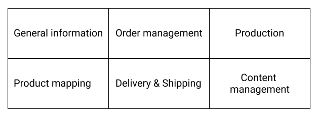
I defined 6 distinct categories, shown below. Smaller API services a fulfiller would need were then sorted appropriately.
![]()
Due to combining 8 applications, the information architecture (IA) needed to be adjusted. Plotting a mind-map helped clarify what belonged where, and identified any questions we still had.
Our users described their workflow through onboarding and production. These were then sent to a broader audience to confirm that the flow was not specialized to one individual, and that the categories I was brainstorming fit their mental model. This was done through a simple card-sorting exercise.

I defined 6 distinct categories, shown below. Smaller API services a fulfiller would need were then sorted appropriately.
Design & Visuals
With the IA defined, I began work on the UI. There was a demonstrated need for a new tabular component. Other applications had also struggled with organizing content when the user flow was a loose step-by-step process.

View the Cimpress React Library.


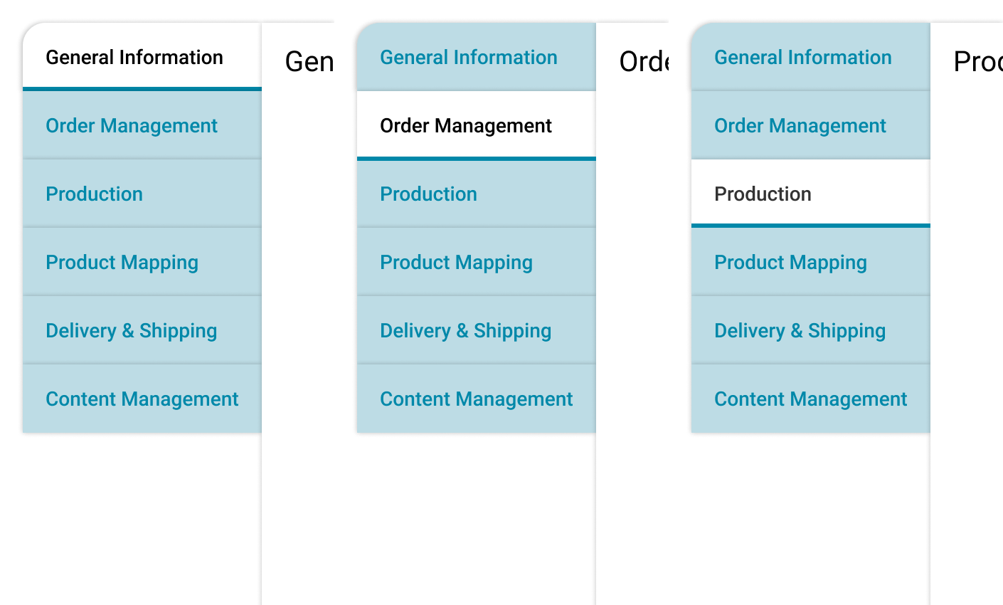
Once that component was developed, I had a starting point for the rest of the UI.

I communicated directly with our engineers about what user interactions I expected the UI to have, as well as how to indicate UI states – this was crucial to helping the user comprehend the data we were displaying.
![]()
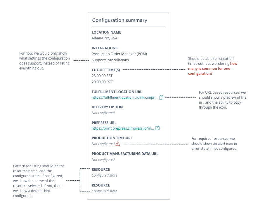
The engineering team was helpfully iterative, and kept me in the know about constraints we had to handle on the technical side.
Some technical constraints I kept in mind were:
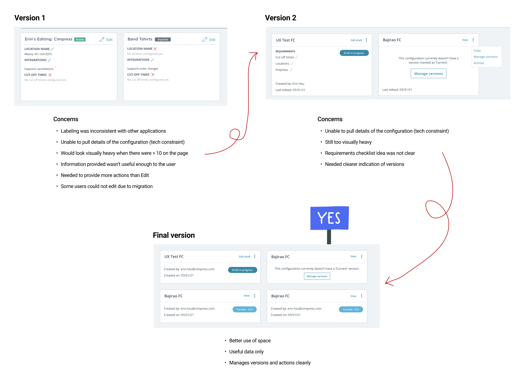
Below is an example of the process I went through for cards, following sync-up sessions with the team.
Some technical constraints I kept in mind were:
- APIs available to pull from
- Lack of detailed data for certain fields (out of scope)
- How they were handling migration from the legacy system to the new one
Below is an example of the process I went through for cards, following sync-up sessions with the team.
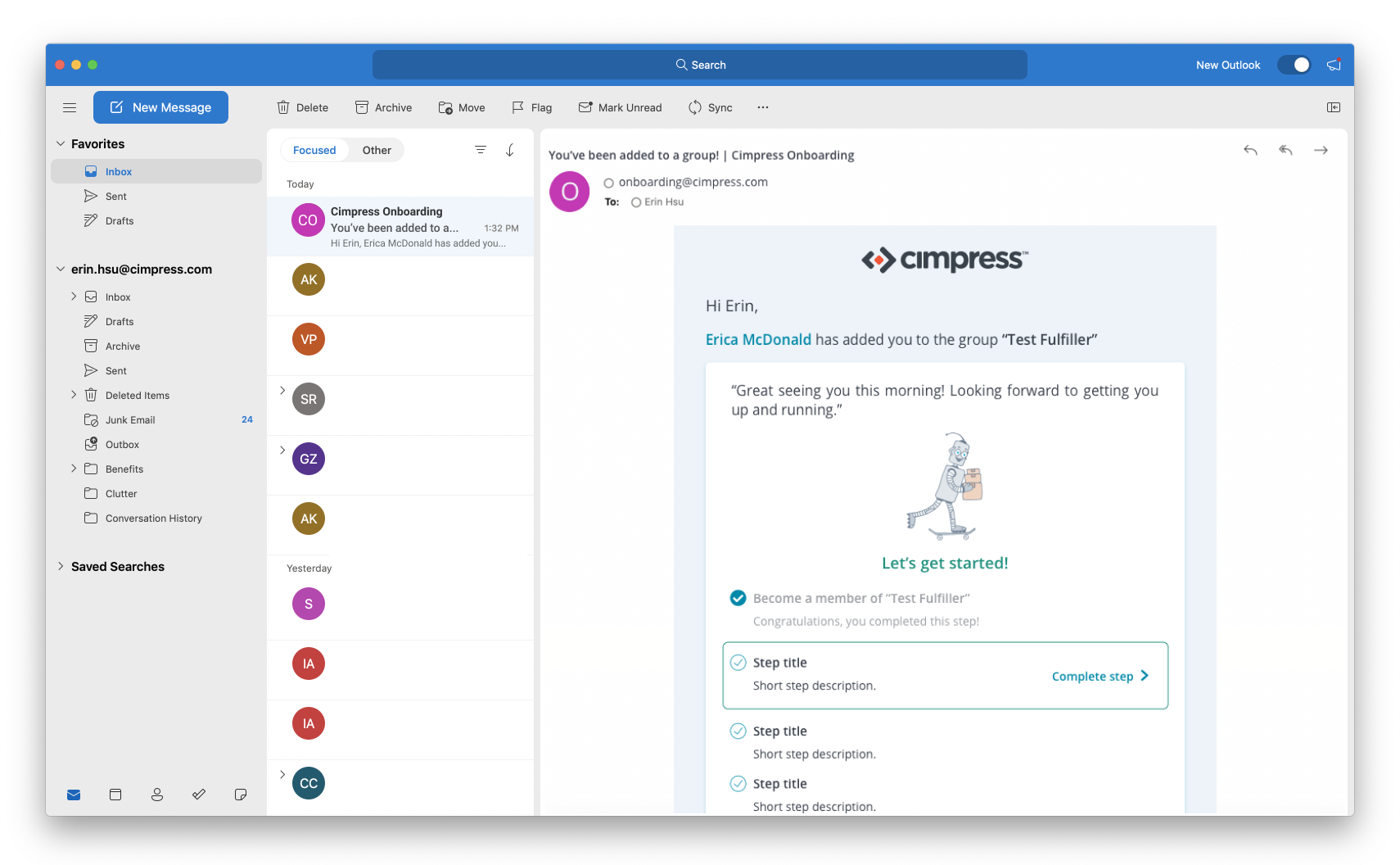
In addition to the UI, we needed to make onboarding material polished. I created email templates, addressing the request from business partners of having whitelabeled emails available for use.
User Journey Research
The team wanted to better document the user journey and validate our work; this would also act as a template for future journey map research initiatives.
![]()
Through a three-hour workshop, I partnered with my domain’s UX lead and walked through our understanding of the user journey. These findings would help identify the places we needed to improve navigational ability across the platform.
Workshop Goals
I documented our findings in Miro. After the session, I converted our loose notes into a user journey map, by application. As shown below, each rectangle identifies a key ‘task’ for the user.
While expansive, we now knew what our quick wins were, and where to put our efforts in the coming months.
The team wanted to better document the user journey and validate our work; this would also act as a template for future journey map research initiatives.
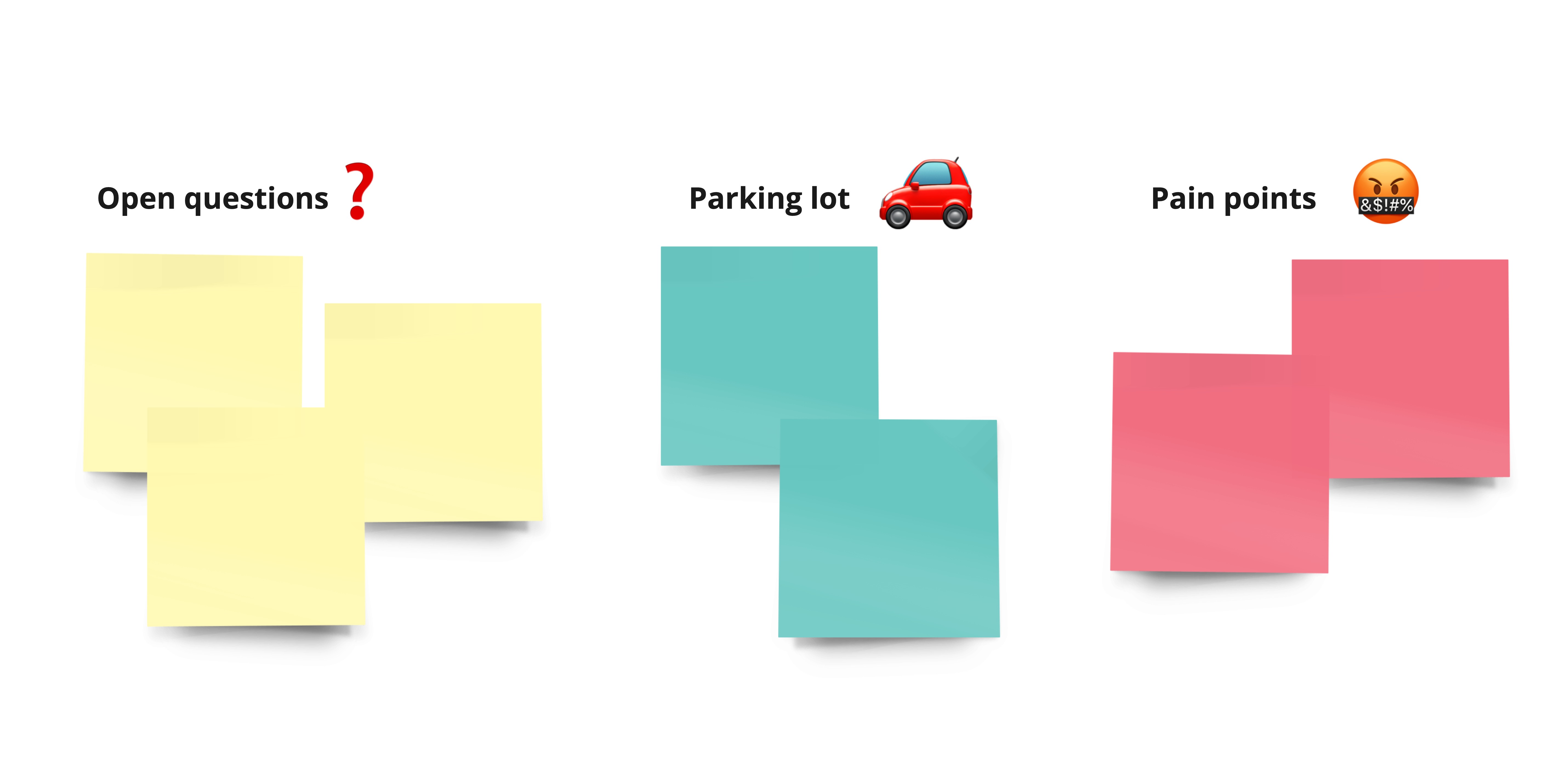
Workshop Goals
- Kick off user journey documentation initiative
- Identify remaining pain points
- Identify remaining navigational friction
- Identify remaining open questions
I documented our findings in Miro. After the session, I converted our loose notes into a user journey map, by application. As shown below, each rectangle identifies a key ‘task’ for the user.
While expansive, we now knew what our quick wins were, and where to put our efforts in the coming months.

Reflection
As this project continues to be in flight, I’ll undoubtedly be creating more iterations and fine-tuning the research findings. It has, however, already proven to be exciting for our users, as they’ve expressed excitement for the new application.
Meals on Tour
1 month | Whimsical & AdobeXDImpact
Live in app with >4k users
Tour directors are responsible for all the moving parts of a tour.
Communicating with restaurants is a big pain point, due to managing traveler numbers, meal restrictions, and using tools that need consistent access to internet.
This was a quick project where I provided a visual solution for a feature in the Tour Director app.
Communicating with restaurants is a big pain point, due to managing traveler numbers, meal restrictions, and using tools that need consistent access to internet.
This was a quick project where I provided a visual solution for a feature in the Tour Director app.
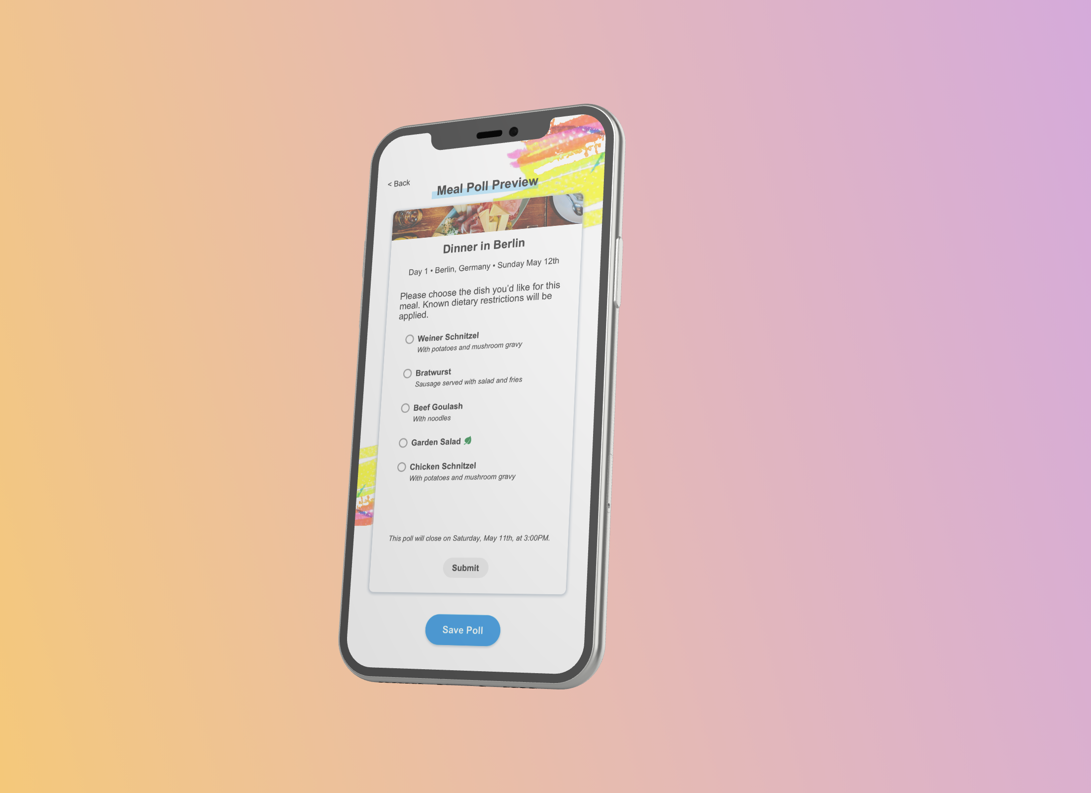
Understanding the problem
Tour directors – people who create and execute the itinerary for an EF tour – currently manage tour meals on paper.
Communicating with restaurants is a large pain point while on tour, due to managing the number of mouths to feed, individual meal restrictions, and the reliance on wifi – which as many of us know can be spotty while traveling. The PM, UX researcher, and lead designer teamed up with me one afternoon to identify the problem we wanted to solve.


Assumptions
- Some tour directors will have limited wifi the day of the meal.
- Not all tour directors will be as comfortable with technology.
- Travelers may prioritize food restrictions when choosing their meals.
- Restaurants will need multi-hour notice of the orders.
Requirements
- Must allow traveler responses
- Must allow tour director to edit meals
- Must allow indication of food restrictions/manual descriptions
- Must allow tour director to send orders to restaurant early
Low Fidelity Design
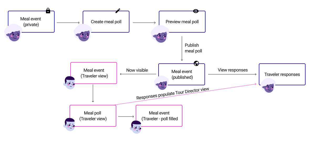
Keeping in mind the requirements, I sketched out potential user flows and needed views. There were two views to build: the tour director’s and the traveler’s.
![]()
After finalizing a flow, I transferred the hand-sketches to Whimsical. The focus here was clarity, especially considering how not all of our users would be as technologically proficient as the average teenager.
Keeping in mind the requirements, I sketched out potential user flows and needed views. There were two views to build: the tour director’s and the traveler’s.


High Fidelity Design
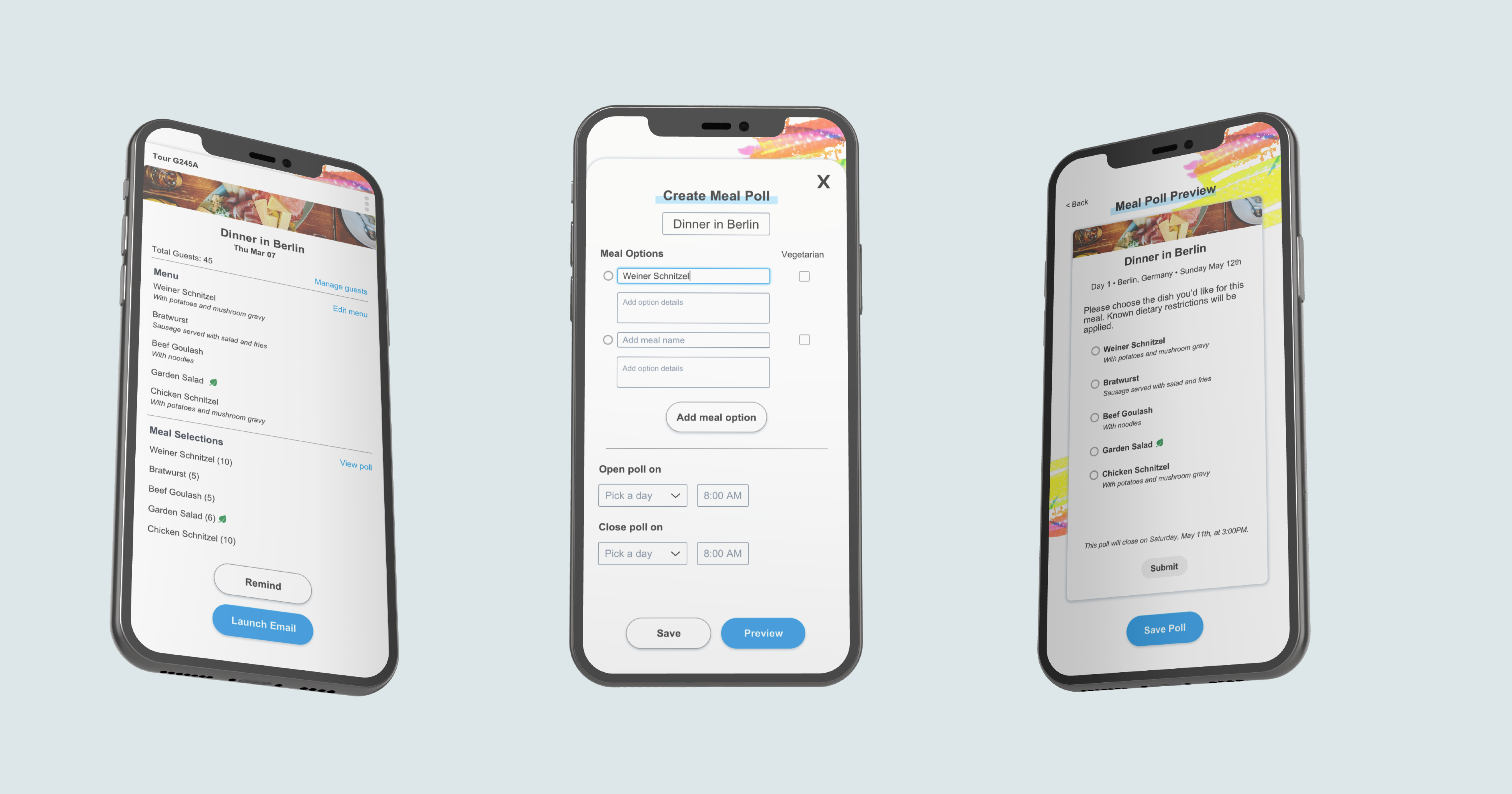
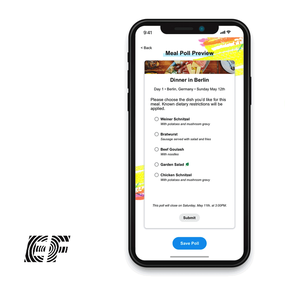
High-fidelity wires were built in Adobe XD, as the EF Design Library is primarily in Adobe suite. The app is immensely minimal and clean in its UI, so I made sure the survey creation form fields were aligned with the other features.
High-fidelity wires were built in Adobe XD, as the EF Design Library is primarily in Adobe suite. The app is immensely minimal and clean in its UI, so I made sure the survey creation form fields were aligned with the other features.
Handoff
I walked the lead designer through the hi-fidelity prototype, and made small interaction adjustments to align more closely with other EF applications. The lead designer then received the finalized wires from my end to bring to the development team. Unfortunately, this was around the tail end of my time at EF, and I was unable to be there for the full development of the feature.
I did, however, meet a handful of Tour Directors in person during another research event and was able to validate the assumptions I had that informed the end design.
JumboSocial
1 year | Sketch, Zeplin, Adobe IllustratorLive from April 26 - May 19.
Impact
Downloaded by >1k users at launch
On the last day of classes, a social dating app built by a small group of seniors is launched exclusively for the graduating class at Tufts, available for only a few weeks.
I partnered with a friend and fellow designer to create JumboSocial’s UI, design system, and overall brand.
I partnered with a friend and fellow designer to create JumboSocial’s UI, design system, and overall brand.

Requirements
We knew that the senior class was eager for their exclusive socializing app, and didn’t want to disappoint. The tradition is that each year must start from scratch – no shared code base, and no old designs.
What we wanted to emphasize was the graduation factor – the end of undergraduate and the inevitable movement of friends all across the globe. That’s how JumboSocial came to be: a focus on meeting people you may not have had the chance to before, to form a final connection before commencement.
![]()
Requirements we landed on as a team were:
Brand
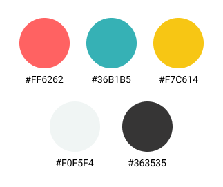
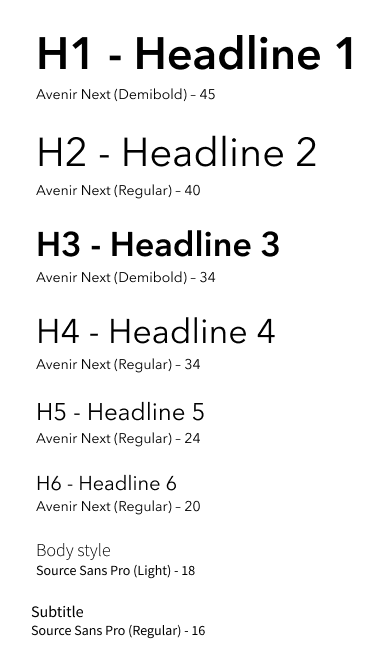
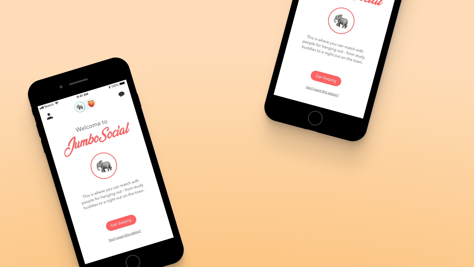
Colors, fonts, icon styles, and copy tone were all decided on in order to convey a unified brand.
Because of our user base, the lighthearted purpose of the app, and a scheduled release during the spring, we chose a color palette that was fun and bright. The brand font had the same identity in mind.
![]()
![]() Though he would rarely show up in the app, we wanted a character for the JumboSocial brand. I came up with Arthur, our elephant that was a spin off the university mascot.
Though he would rarely show up in the app, we wanted a character for the JumboSocial brand. I came up with Arthur, our elephant that was a spin off the university mascot.
He started as a napkin sketch, and was finalized in Adobe Illustrator with a range of emotions.
We knew that the senior class was eager for their exclusive socializing app, and didn’t want to disappoint. The tradition is that each year must start from scratch – no shared code base, and no old designs.
What we wanted to emphasize was the graduation factor – the end of undergraduate and the inevitable movement of friends all across the globe. That’s how JumboSocial came to be: a focus on meeting people you may not have had the chance to before, to form a final connection before commencement.

Requirements we landed on as a team were:
- Traditional matching, swiping, and messaging features in dating and social apps
- Clear account and notification management
- Ability to handle biographies and pictures
- A fun, welcoming, and celebratory brand
- User delight
Brand
Colors, fonts, icon styles, and copy tone were all decided on in order to convey a unified brand.
Because of our user base, the lighthearted purpose of the app, and a scheduled release during the spring, we chose a color palette that was fun and bright. The brand font had the same identity in mind.
He started as a napkin sketch, and was finalized in Adobe Illustrator with a range of emotions.

Design System
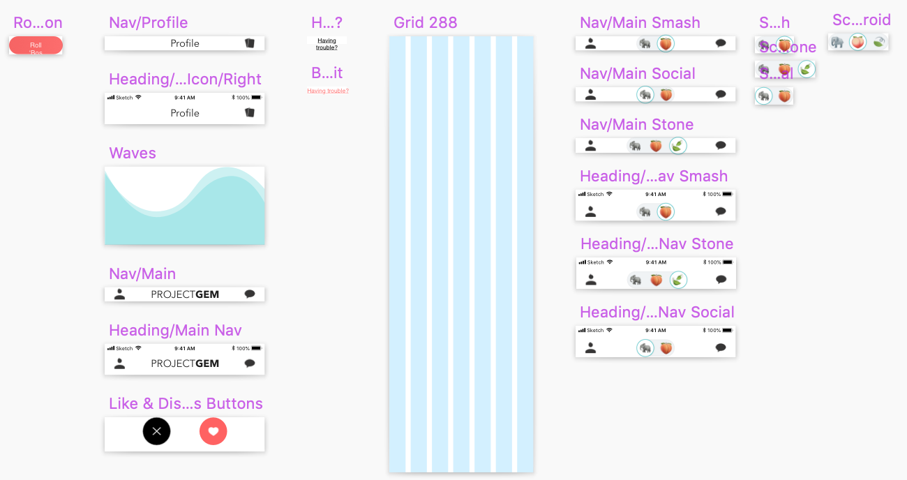
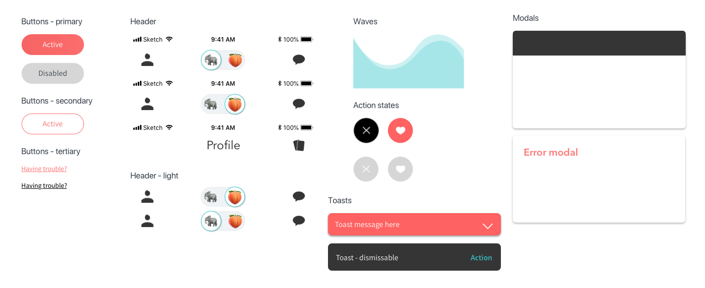
The design system began in Sketch, with a library file being the key to sharing designs back and forth. This was, admittedly, the days before enterprise software plans and Sketch cloud were readily available to us as students.
![]()
It quickly became apparent this was not a functional way to work.
![]()
![]()
![]()
Zeplin was the decided on design system manager. We used it to iterate quickly, provide details on styling, and share components that the engineers could pull code from.
The design system began in Sketch, with a library file being the key to sharing designs back and forth. This was, admittedly, the days before enterprise software plans and Sketch cloud were readily available to us as students.


Zeplin was the decided on design system manager. We used it to iterate quickly, provide details on styling, and share components that the engineers could pull code from.

App Design
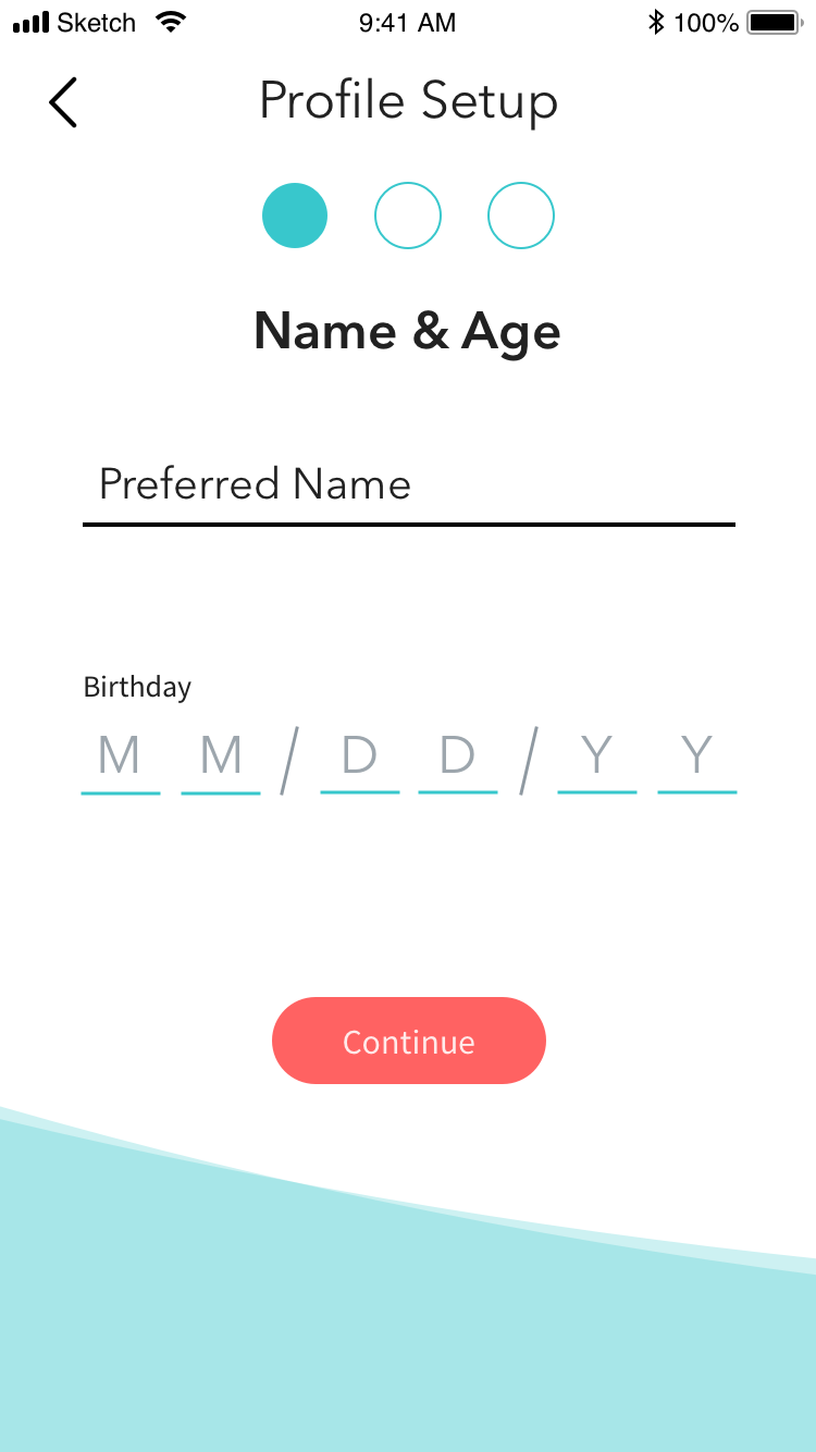
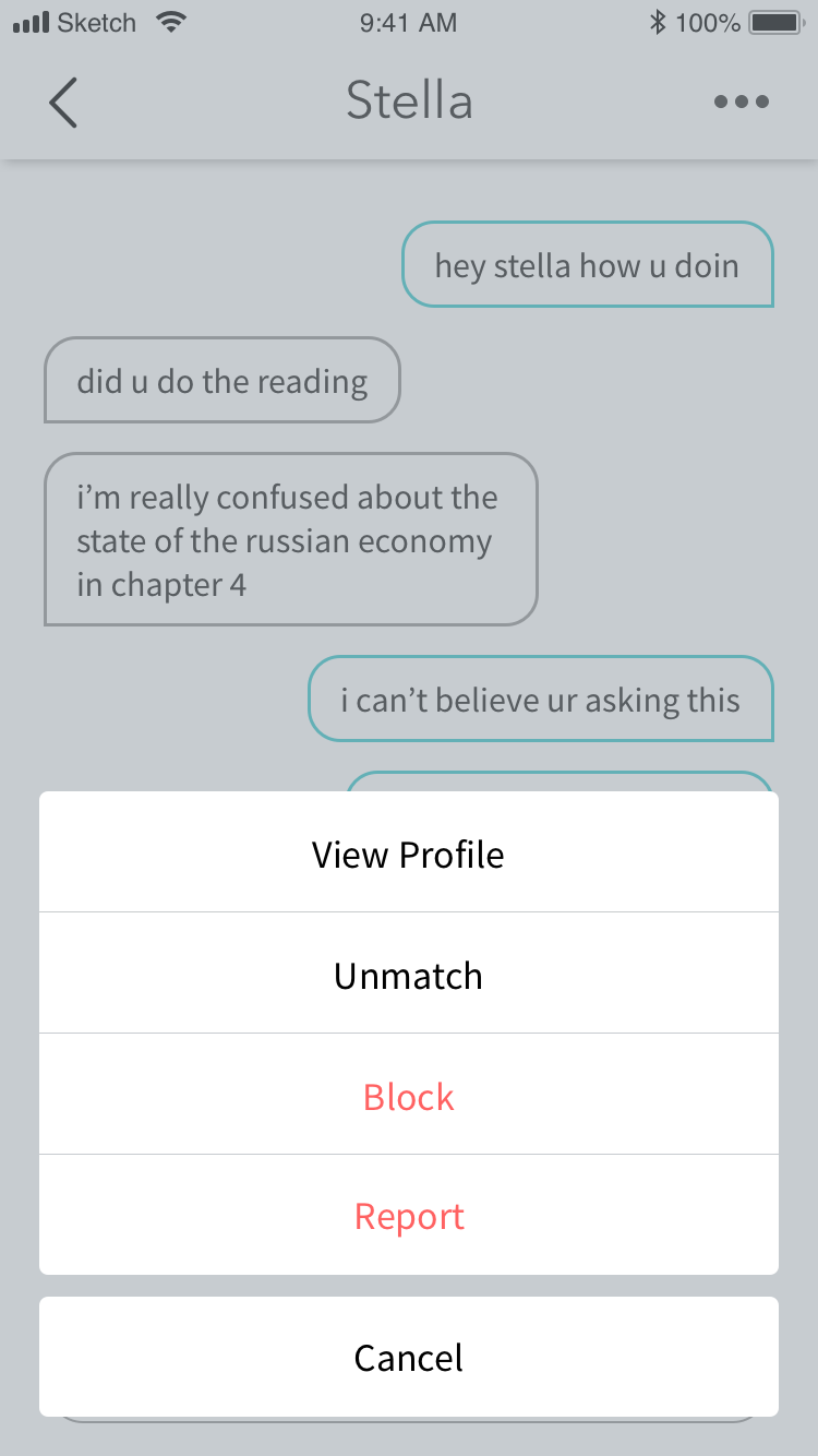
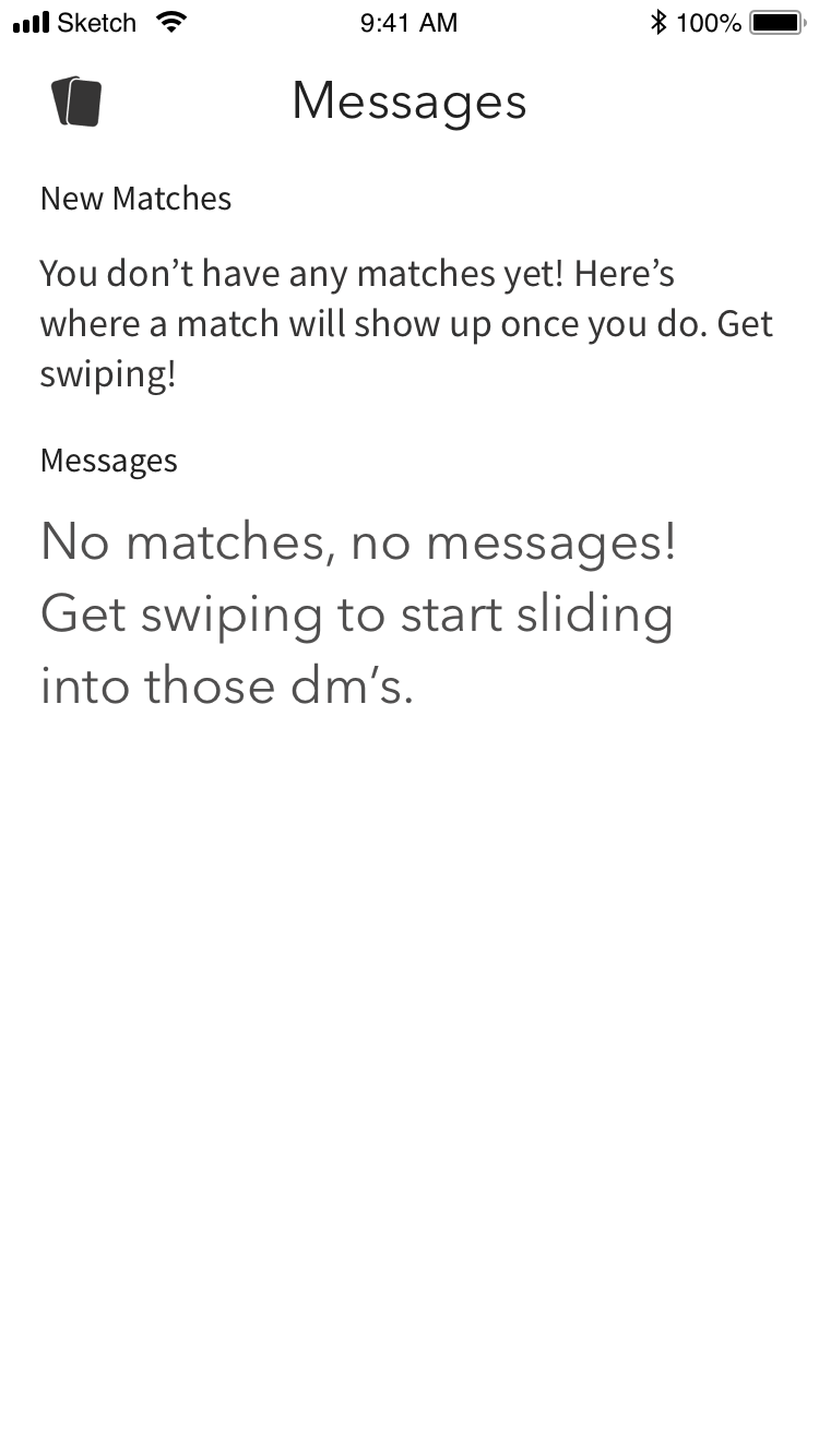
High fidelity wires were in continuous iteration as the app was built. We also oversaw animations and user interactions in the final product.
![]()
High fidelity wires were in continuous iteration as the app was built. We also oversaw animations and user interactions in the final product.





Beta Testing & Looking Back
Before launch, the team allowed a small number of students to get on the app. This allowed us to test interaction patterns, user flow, understanding of icon choices, copy, and get a general opinion of the design style.
Past helping to put together the testing moderater’s guide, Jillian spearheaded the remaining design work.
To this day, this project remains a favorite – it was an extremely creative process, as well as a highlight of my college design career. In retrospect, there are changes that I would make (I would have gone for a less bubbly aesthetic) but I look back on it all fondly.
Creating and figuring out how to manage a design system from the ground up was immensely educational. Even though we were only a team of two, it provided valuable skills for how to work and create for design systems.
