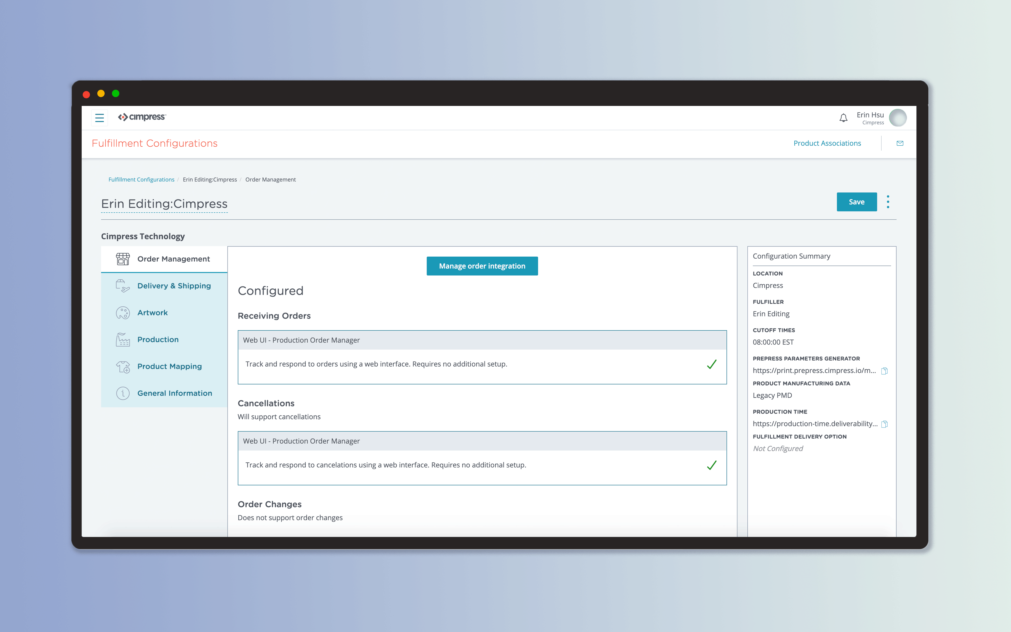
Fulfillment Configuration
3 months | Sketch, Miro, WhimsicalImpact
Fulfilled self-service initiative OKR (FY2020).
Research used for unified navigation effort OKR (FY2021).
The fulfillment process is crucial to Cimpress’ support of their internal businesses. The overarching goal for the project was to empower users towards a self-service onboarding of fulfillment details.
I led the design for a sleeker fulfillment configuration product, and conducted research to better document the user journey.
This application was a major milestone for the onboarding of one of our largest European fulfillers.
Context
As this project focused on a legacy system, I took time to understand what decisions had been made prior to the current day initiative.
Network managers were struggling to configure fulfillers because they had to jump between 8 different applications. There were a variety of roadblocks that users could run into during this process; alongside the sheer volume of information a user had to manage, the onboarding process was daunting to approach for those less technically savvy.
Frustration with the system was further offset by the importance of ensuring everything was configured correctly: if something went wrong, it would impact the entire order flow and production.
![]()
From the multitude of domain personas, the PM and I identified the main concerns for our primary persona.
As this project focused on a legacy system, I took time to understand what decisions had been made prior to the current day initiative.
Network managers were struggling to configure fulfillers because they had to jump between 8 different applications. There were a variety of roadblocks that users could run into during this process; alongside the sheer volume of information a user had to manage, the onboarding process was daunting to approach for those less technically savvy.
Frustration with the system was further offset by the importance of ensuring everything was configured correctly: if something went wrong, it would impact the entire order flow and production.

From the multitude of domain personas, the PM and I identified the main concerns for our primary persona.


With the problem areas identified, I defined what made the most sense for us to prioritize in the redesign.
Redesign goals
Redesign goals
- Streamline user flow
- Introduce hierarchy to configuration details
- Rework UI to make application more polished
- Improve within app and cross-app navigation
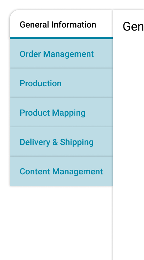
Information Architecture
Due to combining 8 applications, the information architecture (IA) needed to be adjusted. Plotting a mind-map helped clarify what belonged where, and identified any questions we still had.
Our users described their workflow through onboarding and production. These were then sent to a broader audience to confirm that the flow was not specialized to one individual, and that the categories I was brainstorming fit their mental model. This was done through a simple card-sorting exercise.
![]()
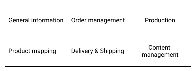
I defined 6 distinct categories, shown below. Smaller API services a fulfiller would need were then sorted appropriately.
![]()
Due to combining 8 applications, the information architecture (IA) needed to be adjusted. Plotting a mind-map helped clarify what belonged where, and identified any questions we still had.
Our users described their workflow through onboarding and production. These were then sent to a broader audience to confirm that the flow was not specialized to one individual, and that the categories I was brainstorming fit their mental model. This was done through a simple card-sorting exercise.

I defined 6 distinct categories, shown below. Smaller API services a fulfiller would need were then sorted appropriately.
Design & Visuals
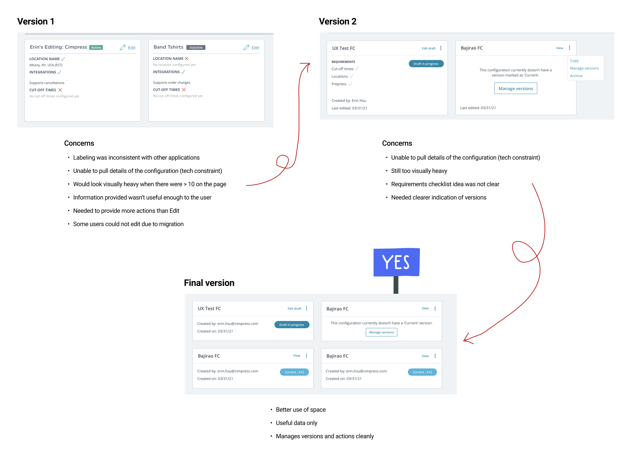
With the IA defined, I began work on the UI. There was a demonstrated need for a new tabular component. Other applications had also struggled with organizing content when the user flow was a loose step-by-step process.

View the Cimpress React Library.


Once that component was developed, I had a starting point for the rest of the UI.

I communicated directly with our engineers about what user interactions I expected the UI to have, as well as how to indicate UI states – this was crucial to helping the user comprehend the data we were displaying.
![]()
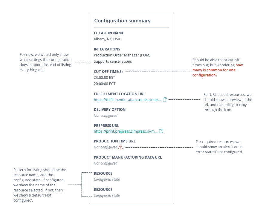
The engineering team was helpfully iterative, and kept me in the know about constraints we had to handle on the technical side.
Some technical constraints I kept in mind were:
Below is an example of the process I went through for cards, following sync-up sessions with the team.
Some technical constraints I kept in mind were:
- APIs available to pull from
- Lack of detailed data for certain fields (out of scope)
- How they were handling migration from the legacy system to the new one
Below is an example of the process I went through for cards, following sync-up sessions with the team.
In addition to the UI, we needed to make onboarding material polished. I created email templates, addressing the request from business partners of having whitelabeled emails available for use.
User Journey Research
The team wanted to better document the user journey and validate our work; this would also act as a template for future journey map research initiatives.
![]()
Through a three-hour workshop, I partnered with my domain’s UX lead and walked through our understanding of the user journey. These findings would help identify the places we needed to improve navigational ability across the platform.
Workshop Goals
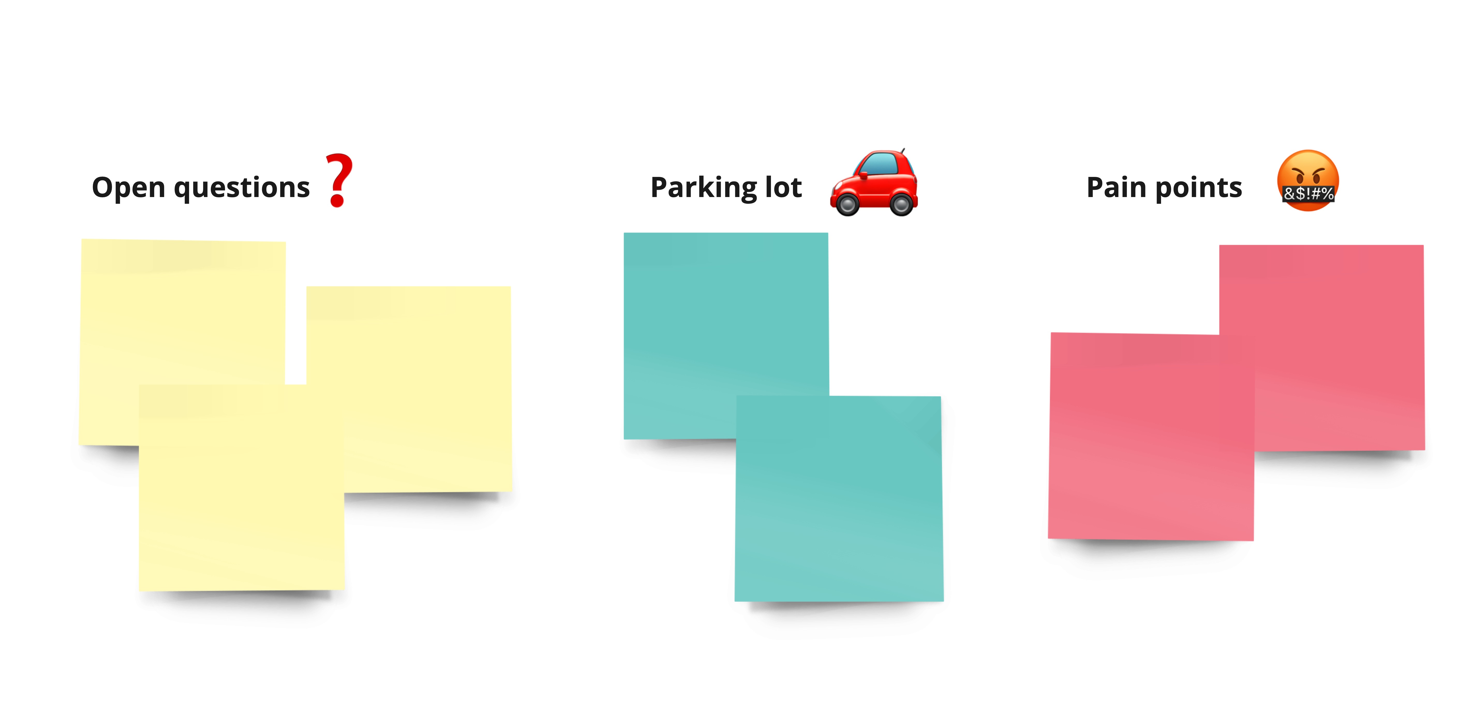
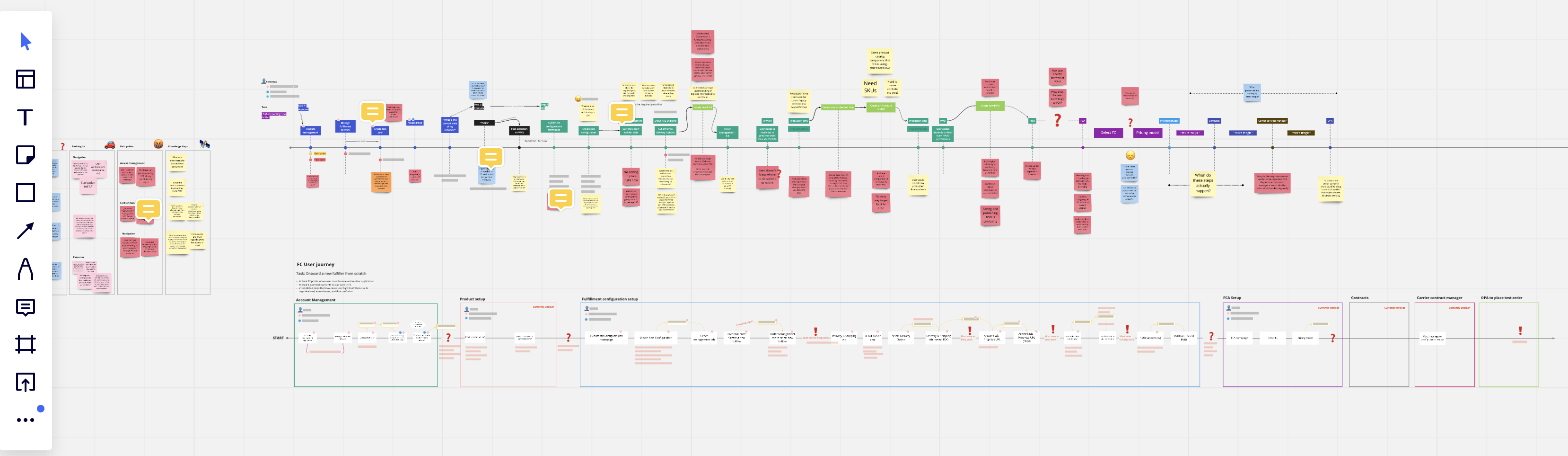
I documented our findings in Miro. After the session, I converted our loose notes into a user journey map, by application. As shown below, each rectangle identifies a key ‘task’ for the user.
While expansive, we now knew what our quick wins were, and where to put our efforts in the coming months.
The team wanted to better document the user journey and validate our work; this would also act as a template for future journey map research initiatives.
Workshop Goals
- Kick off user journey documentation initiative
- Identify remaining pain points
- Identify remaining navigational friction
- Identify remaining open questions
I documented our findings in Miro. After the session, I converted our loose notes into a user journey map, by application. As shown below, each rectangle identifies a key ‘task’ for the user.
While expansive, we now knew what our quick wins were, and where to put our efforts in the coming months.
Reflection
As this project continues to be in flight, I’ll undoubtedly be creating more iterations and fine-tuning the research findings. It has, however, already proven to be exciting for our users, as they’ve expressed excitement for the new application.