JumboSocial
1 year | Sketch, Zeplin, Adobe IllustratorLive from April 26 - May 19.
Impact
Downloaded by >1k users at launch
On the last day of classes, a social dating app built by a small group of seniors is launched exclusively for the graduating class at Tufts, available for only a few weeks.
I partnered with a friend and fellow designer to create JumboSocial’s UI, design system, and overall brand.
I partnered with a friend and fellow designer to create JumboSocial’s UI, design system, and overall brand.

Requirements
We knew that the senior class was eager for their exclusive socializing app, and didn’t want to disappoint. The tradition is that each year must start from scratch – no shared code base, and no old designs.
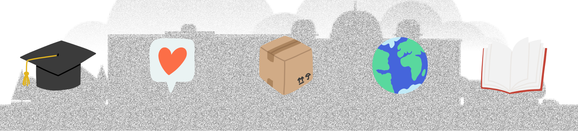
What we wanted to emphasize was the graduation factor – the end of undergraduate and the inevitable movement of friends all across the globe. That’s how JumboSocial came to be: a focus on meeting people you may not have had the chance to before, to form a final connection before commencement.
![]()
Requirements we landed on as a team were:
Brand
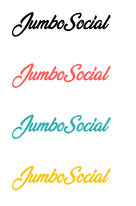
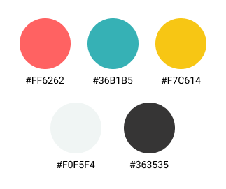
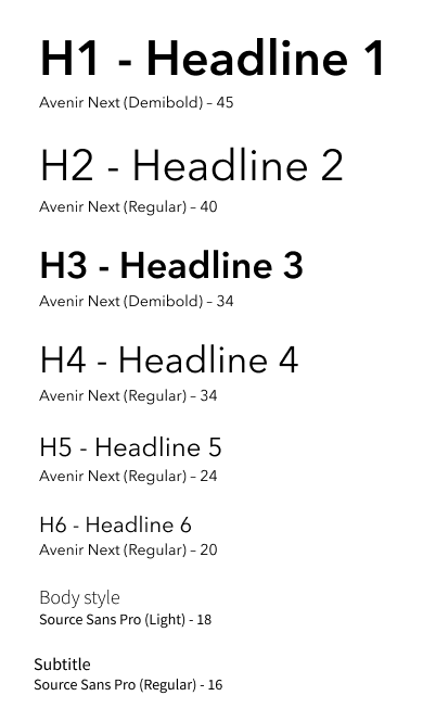
Colors, fonts, icon styles, and copy tone were all decided on in order to convey a unified brand.
Because of our user base, the lighthearted purpose of the app, and a scheduled release during the spring, we chose a color palette that was fun and bright. The brand font had the same identity in mind.
![]()
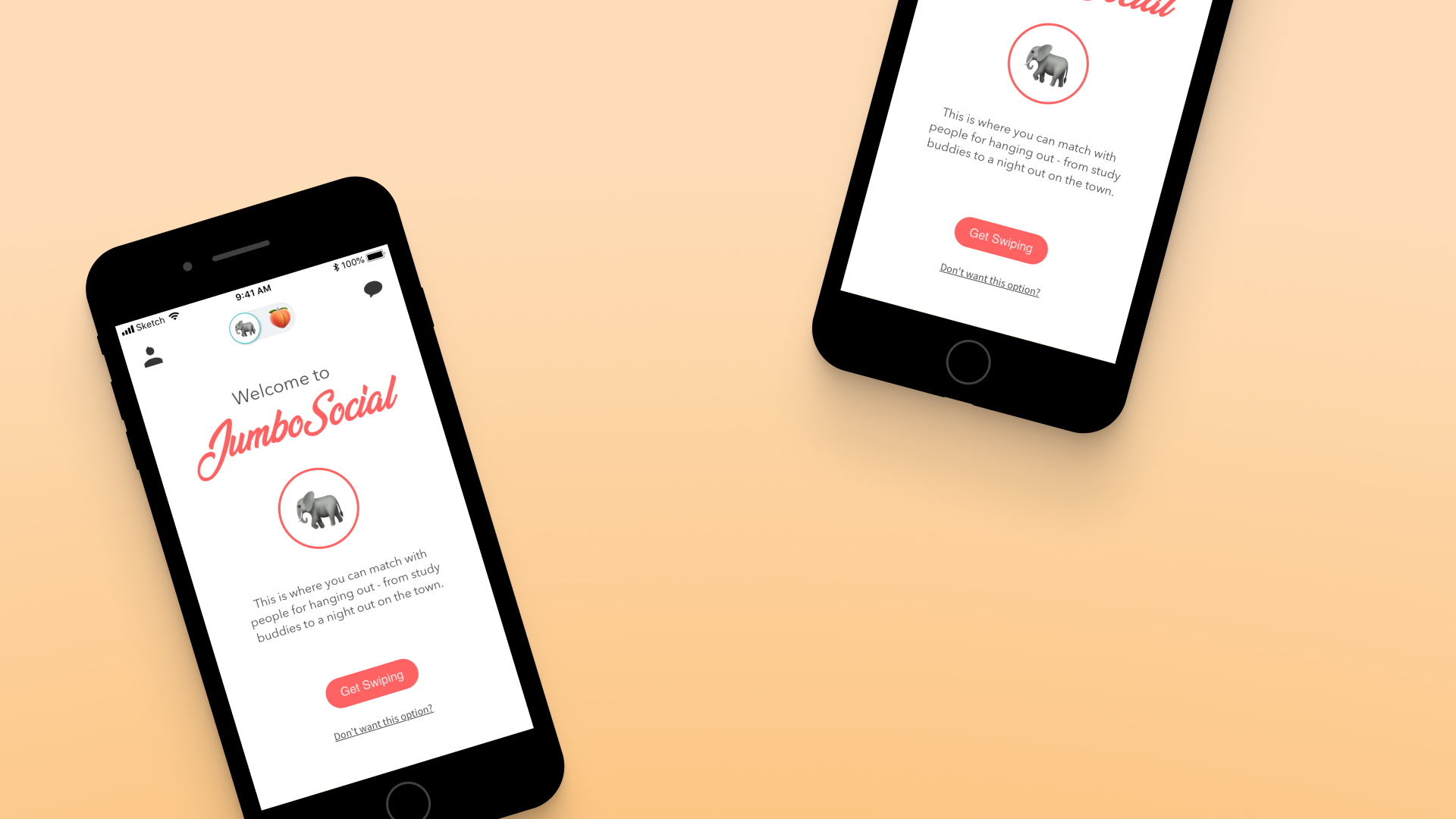
![]() Though he would rarely show up in the app, we wanted a character for the JumboSocial brand. I came up with Arthur, our elephant that was a spin off the university mascot.
Though he would rarely show up in the app, we wanted a character for the JumboSocial brand. I came up with Arthur, our elephant that was a spin off the university mascot.
He started as a napkin sketch, and was finalized in Adobe Illustrator with a range of emotions.
We knew that the senior class was eager for their exclusive socializing app, and didn’t want to disappoint. The tradition is that each year must start from scratch – no shared code base, and no old designs.
What we wanted to emphasize was the graduation factor – the end of undergraduate and the inevitable movement of friends all across the globe. That’s how JumboSocial came to be: a focus on meeting people you may not have had the chance to before, to form a final connection before commencement.
Requirements we landed on as a team were:
- Traditional matching, swiping, and messaging features in dating and social apps
- Clear account and notification management
- Ability to handle biographies and pictures
- A fun, welcoming, and celebratory brand
- User delight
Brand
Colors, fonts, icon styles, and copy tone were all decided on in order to convey a unified brand.
Because of our user base, the lighthearted purpose of the app, and a scheduled release during the spring, we chose a color palette that was fun and bright. The brand font had the same identity in mind.
He started as a napkin sketch, and was finalized in Adobe Illustrator with a range of emotions.

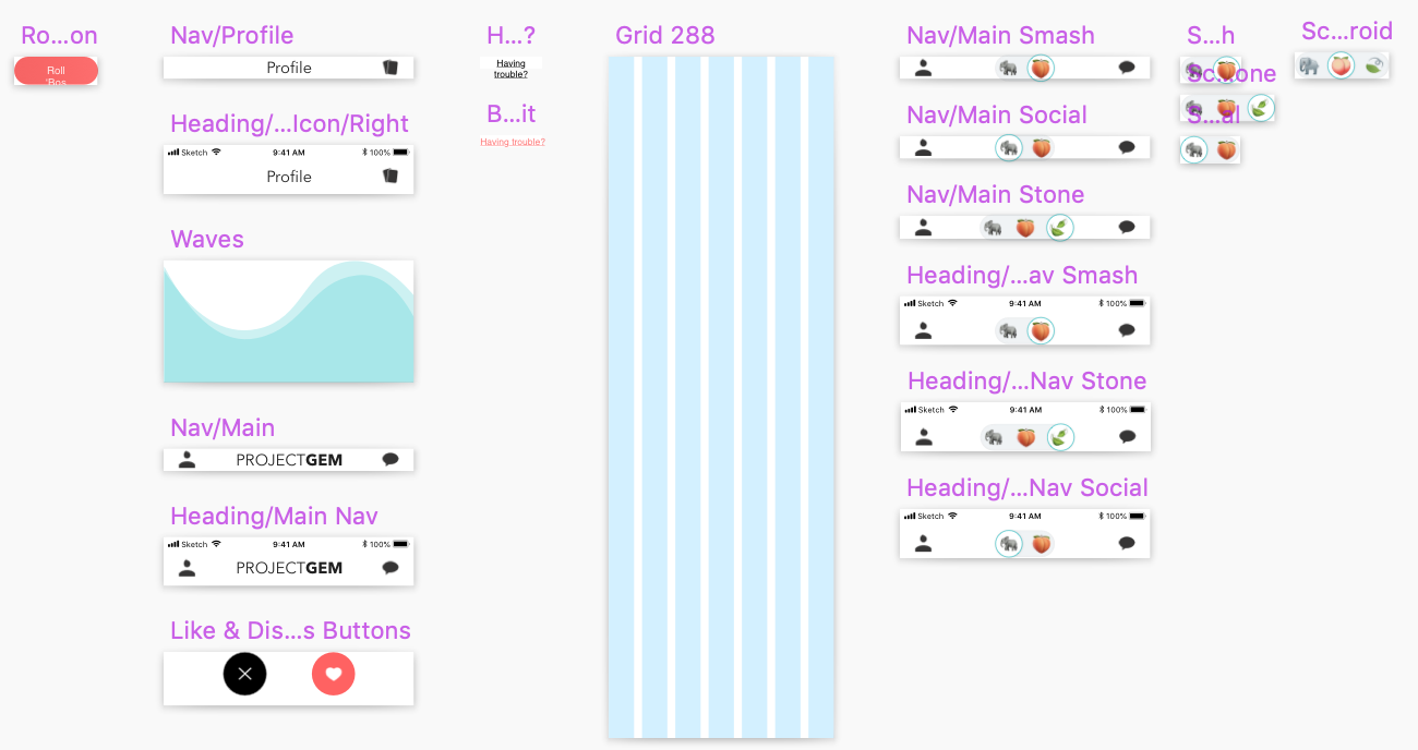
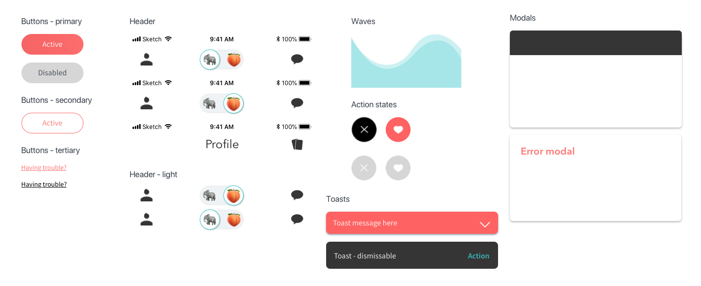
Design System
The design system began in Sketch, with a library file being the key to sharing designs back and forth. This was, admittedly, the days before enterprise software plans and Sketch cloud were readily available to us as students.
![]()
It quickly became apparent this was not a functional way to work.
![]()
![]()
![]()
Zeplin was the decided on design system manager. We used it to iterate quickly, provide details on styling, and share components that the engineers could pull code from.
The design system began in Sketch, with a library file being the key to sharing designs back and forth. This was, admittedly, the days before enterprise software plans and Sketch cloud were readily available to us as students.


Zeplin was the decided on design system manager. We used it to iterate quickly, provide details on styling, and share components that the engineers could pull code from.

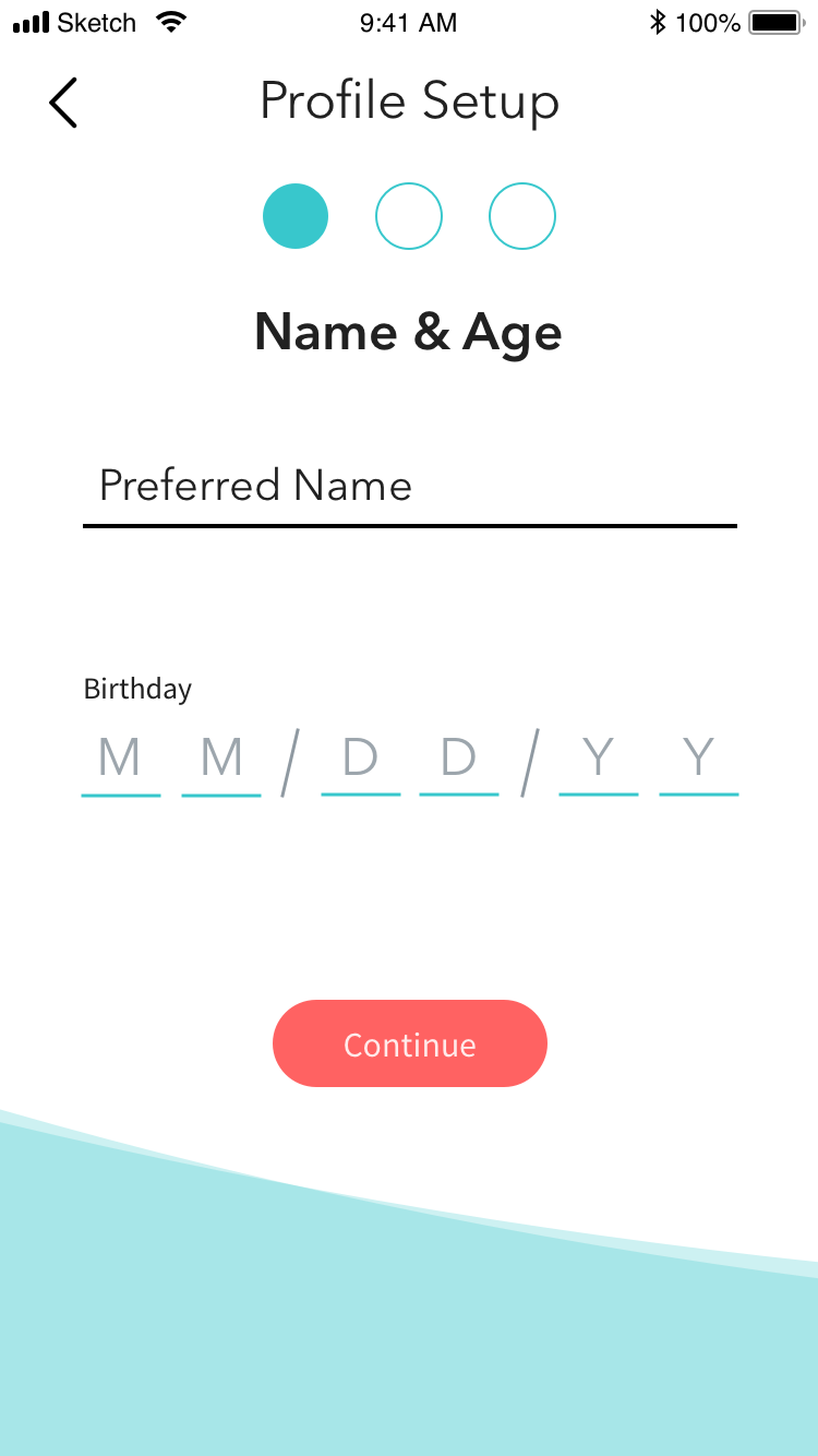
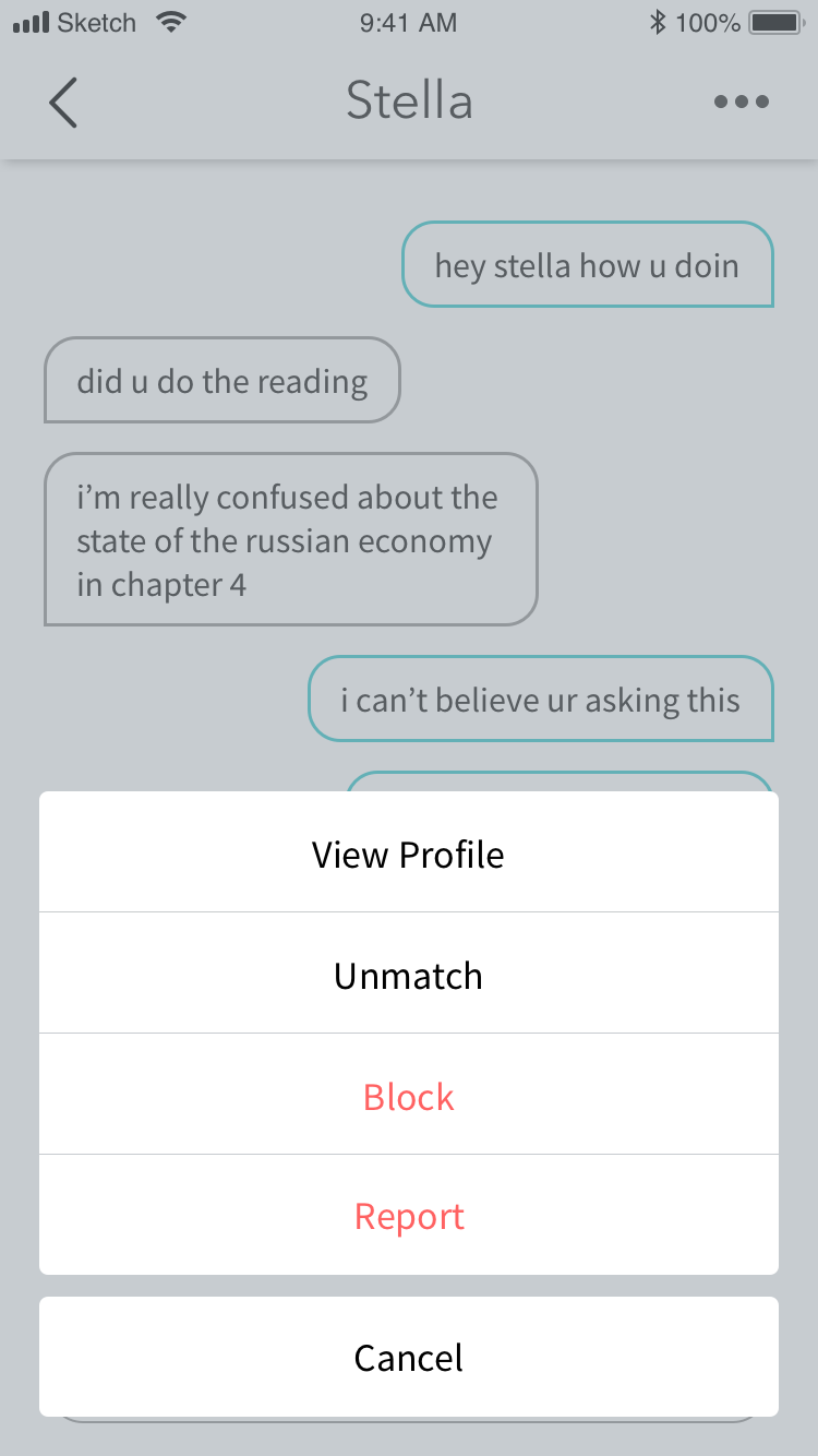
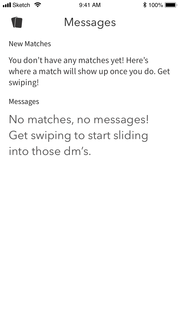
App Design
High fidelity wires were in continuous iteration as the app was built. We also oversaw animations and user interactions in the final product.
![]()
High fidelity wires were in continuous iteration as the app was built. We also oversaw animations and user interactions in the final product.


Beta Testing & Looking Back
Before launch, the team allowed a small number of students to get on the app. This allowed us to test interaction patterns, user flow, understanding of icon choices, copy, and get a general opinion of the design style.
Past helping to put together the testing moderater’s guide, Jillian spearheaded the remaining design work.
To this day, this project remains a favorite – it was an extremely creative process, as well as a highlight of my college design career. In retrospect, there are changes that I would make (I would have gone for a less bubbly aesthetic) but I look back on it all fondly.
Creating and figuring out how to manage a design system from the ground up was immensely educational. Even though we were only a team of two, it provided valuable skills for how to work and create for design systems.
