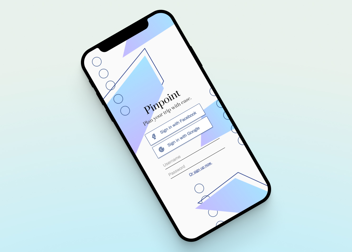
Pinpoint
2 weeks | Figma, Miro, Adobe PhotoshopThe idea for Pinpoint came from the frequent frustration of planning out a trip.
The current process involves switching between multiple tabs and managing a mess of links and relevant information.
I designed Pinpoint to create a specific, centralized solution for a common problem, with more opportunity to add features that would directly benefit the travel experience.
Problem
While there are many tools out there to help organize information, there are none that are specifically built to handle planning a trip.
I’ve watched friends use a variety of Notion, Excel, and Google Docs/Sheets, while switching to and from TripAdvisor (for recommended activities), Yelp (for recommended food), and Maps to plot out the most reasonable routes, keep note of business hours, and understand transportation options. All in all, that’s a frustrating amount of mental load involved.
To get a broader idea of what features users would want, I interviewed a friends who are frequent travelers. I then took mentioned features and needs and considered how they would work as one application.
![]()
![]()
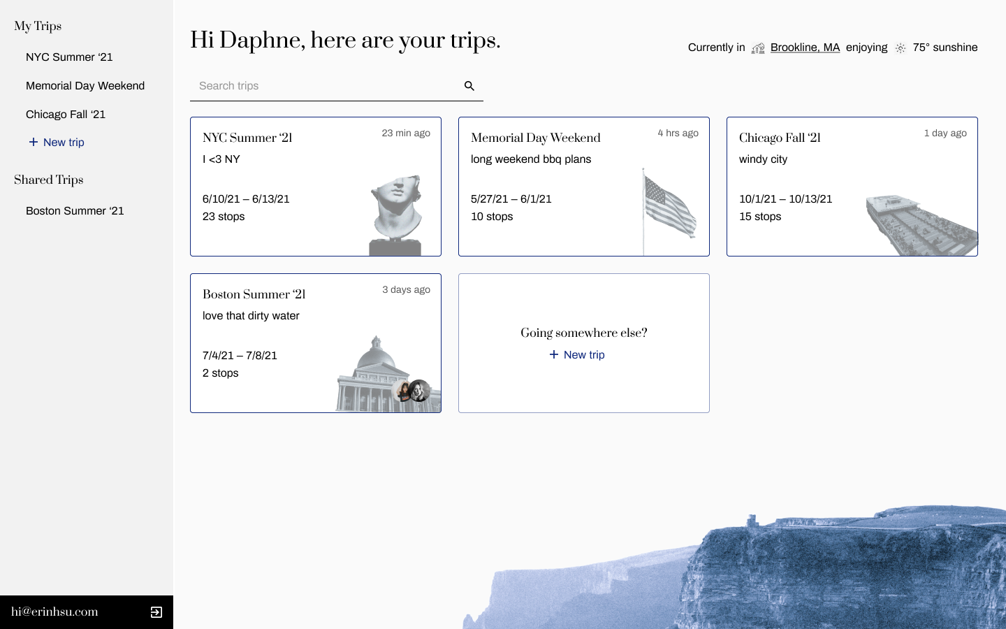
After that, I zeroed in on the user flow for creating a new trip from the homepage.
![]()
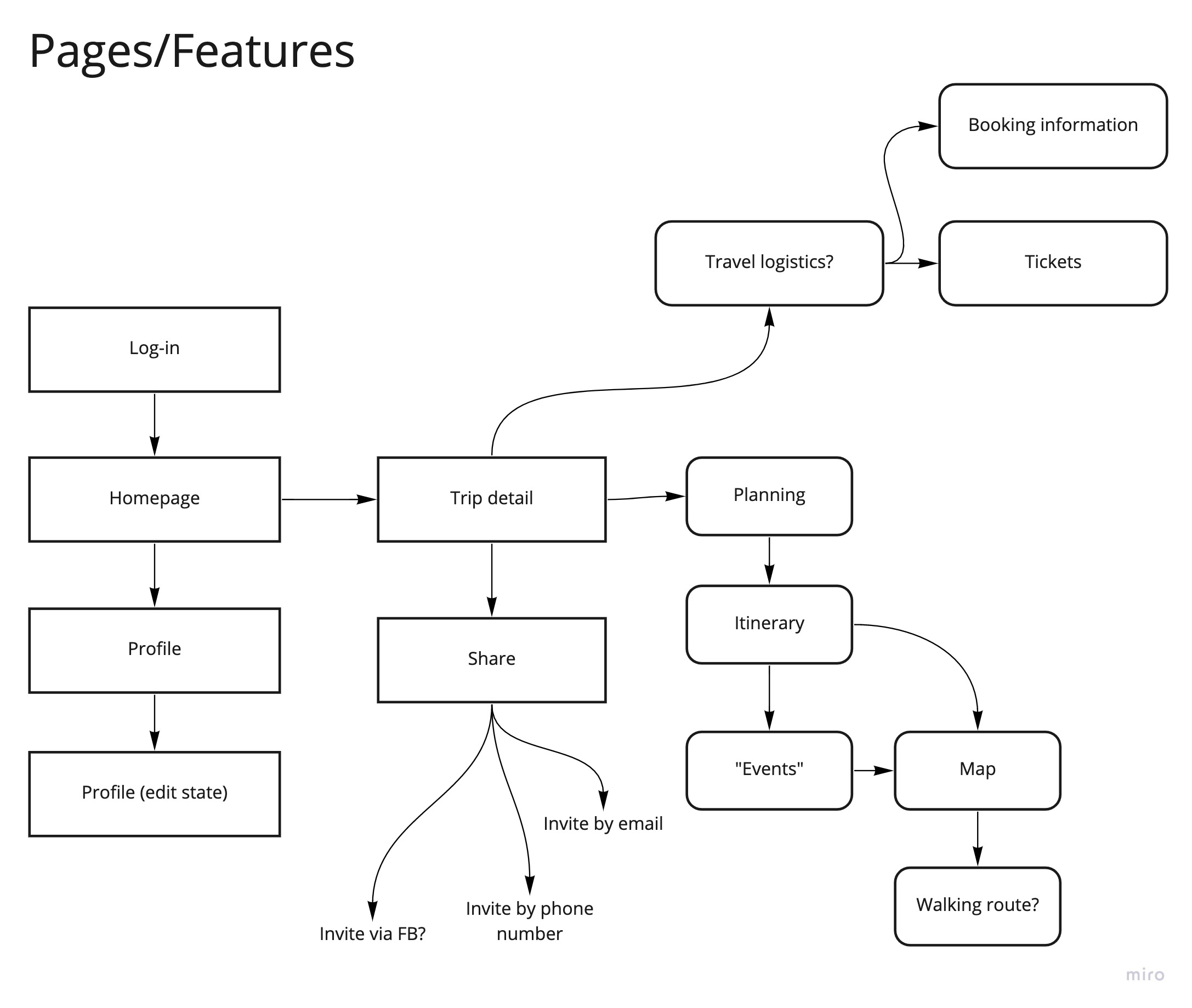
Low Fidelity
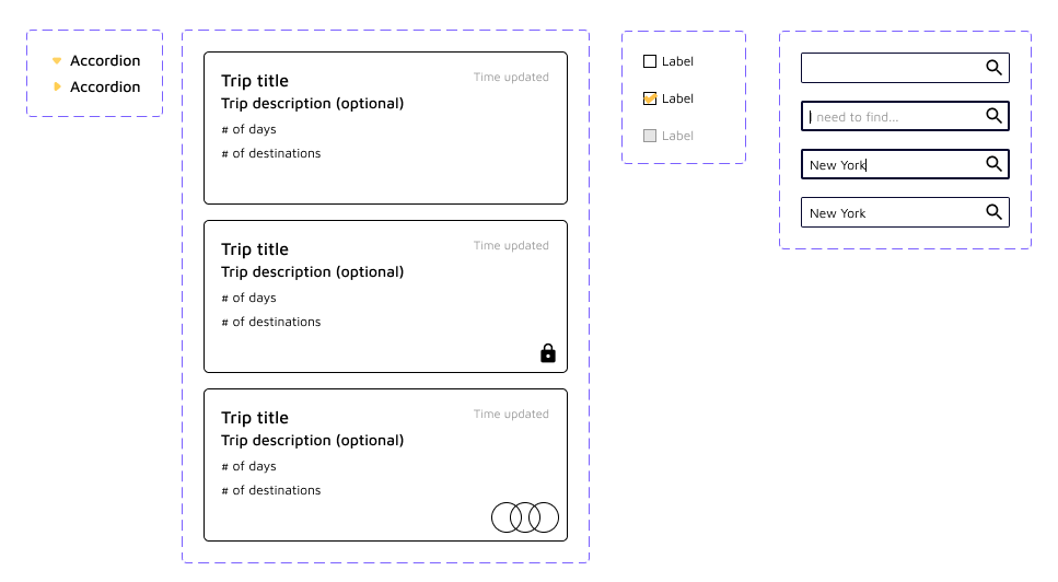
Lo-fi wires were created in Miro, in order to visualise the layout and how a user would move through creating a new trip.
![]()
It made sense for the creation step to handle naming the trip, the dates, and where the first destination would be. Then, the user would land in the heavier itinerary management page.
When planning a trip, most people organize by day. Users have a mental model of planning out activities in the most cohesive manner geographically – travel time and an overview of where places are in relation to one another were therefore important.
![]()
Operating off the assumption that the user wouldn’t be extremely familiar with the area, it makes sense to allow users to move the stops around. Business hours, holidays, and a better picture of locations will also impact how stops are ordered.
Another feature that was said to be useful is the ability to have a packing list, particularly when sharing a trip with friends.
![]()
While there are many tools out there to help organize information, there are none that are specifically built to handle planning a trip.
I’ve watched friends use a variety of Notion, Excel, and Google Docs/Sheets, while switching to and from TripAdvisor (for recommended activities), Yelp (for recommended food), and Maps to plot out the most reasonable routes, keep note of business hours, and understand transportation options. All in all, that’s a frustrating amount of mental load involved.
To get a broader idea of what features users would want, I interviewed a friends who are frequent travelers. I then took mentioned features and needs and considered how they would work as one application.

After that, I zeroed in on the user flow for creating a new trip from the homepage.
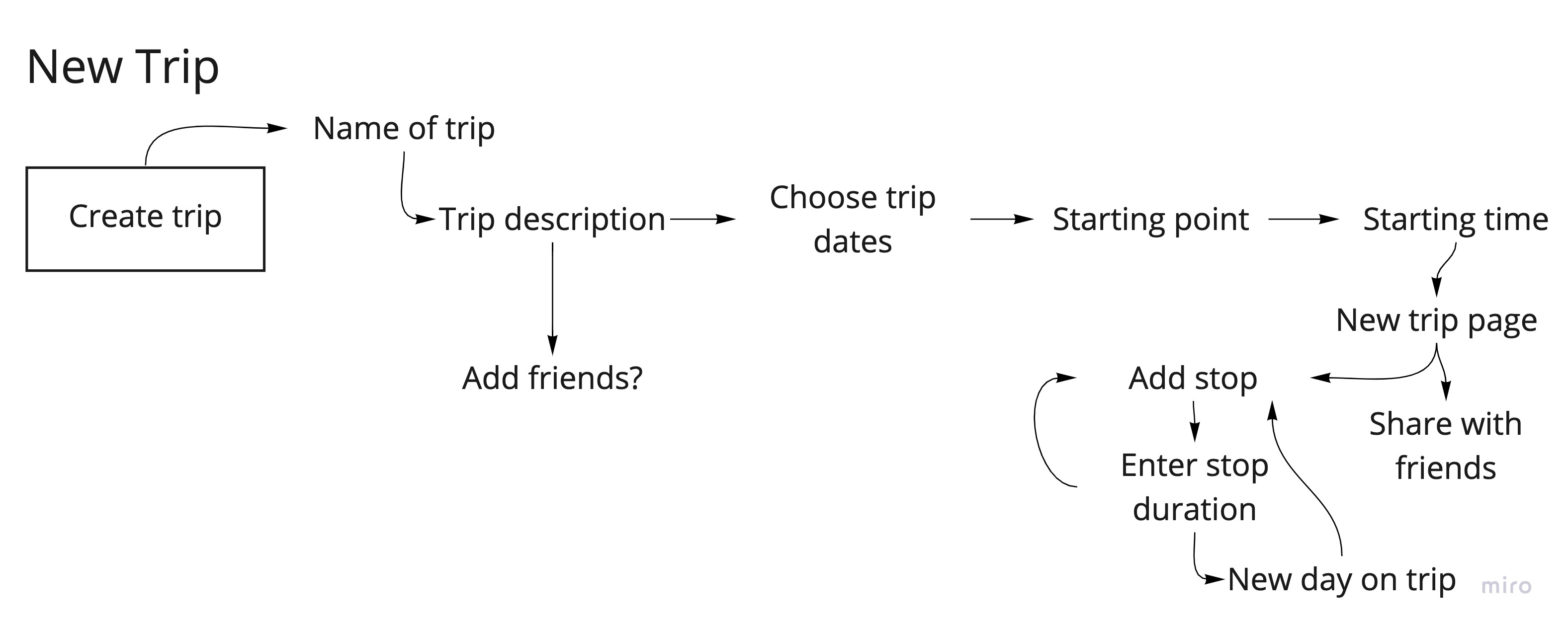
Lo-fi wires were created in Miro, in order to visualise the layout and how a user would move through creating a new trip.

When planning a trip, most people organize by day. Users have a mental model of planning out activities in the most cohesive manner geographically – travel time and an overview of where places are in relation to one another were therefore important.
Another feature that was said to be useful is the ability to have a packing list, particularly when sharing a trip with friends.

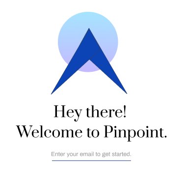
Identity Exploration
The stylistic identity of the UI changed a lot early on, as I was unsure whether I wanted Pinpoint to be bright and friendly, or sleeker and elegant. Below are some initial explorations in color, font pairings, and branding.


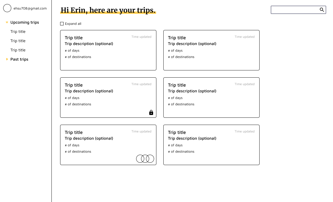
I started off with a couple of components, laying them out following the lo-fi wires – but it felt off, and almost too young for the original intent. This is a trip planner for college students and older, and therefore needed a sleeker, more mature design identity.
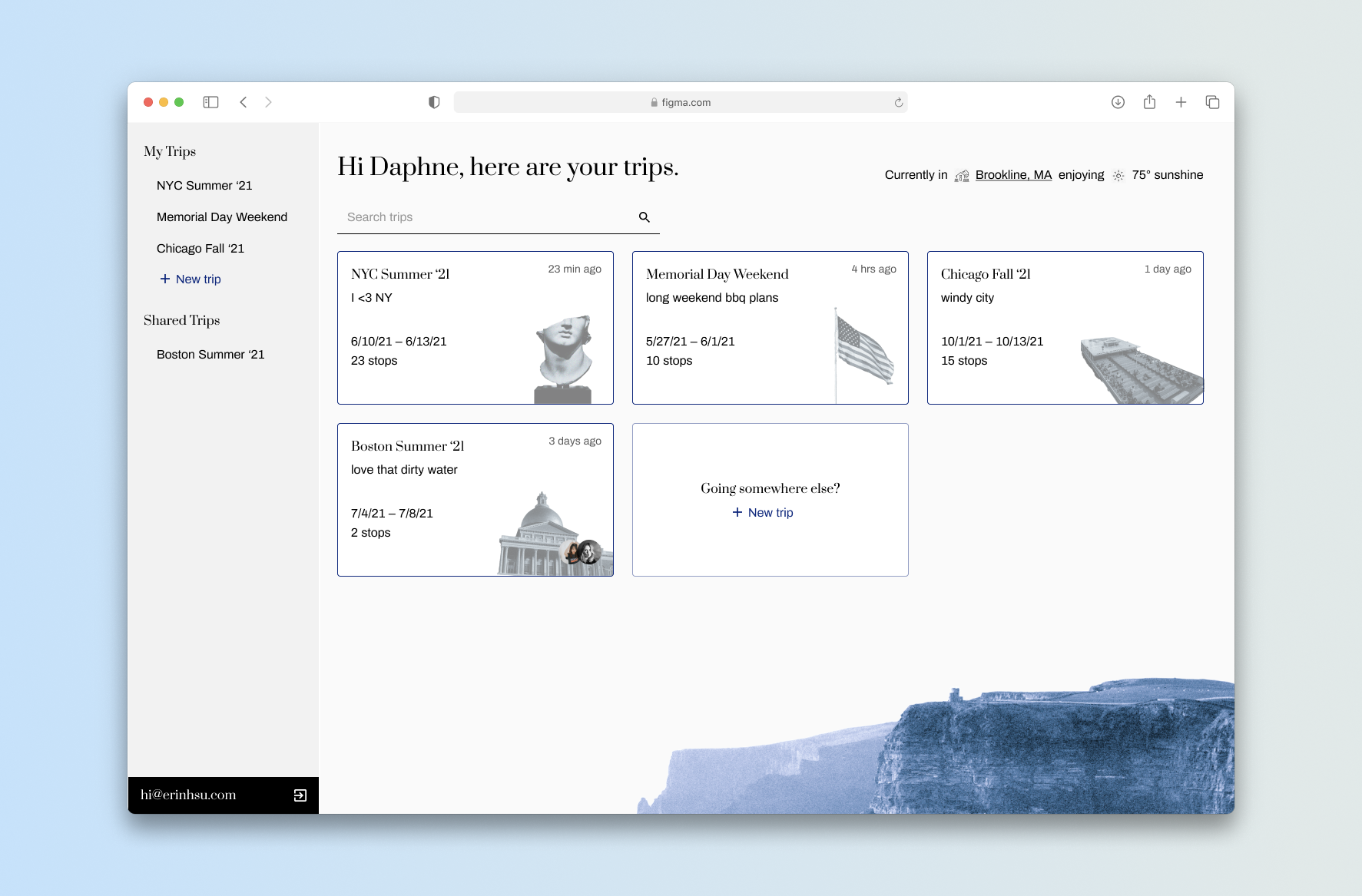
High Fidelity
Once I’d settled on a design language, high fidelity wires were built in Figma.
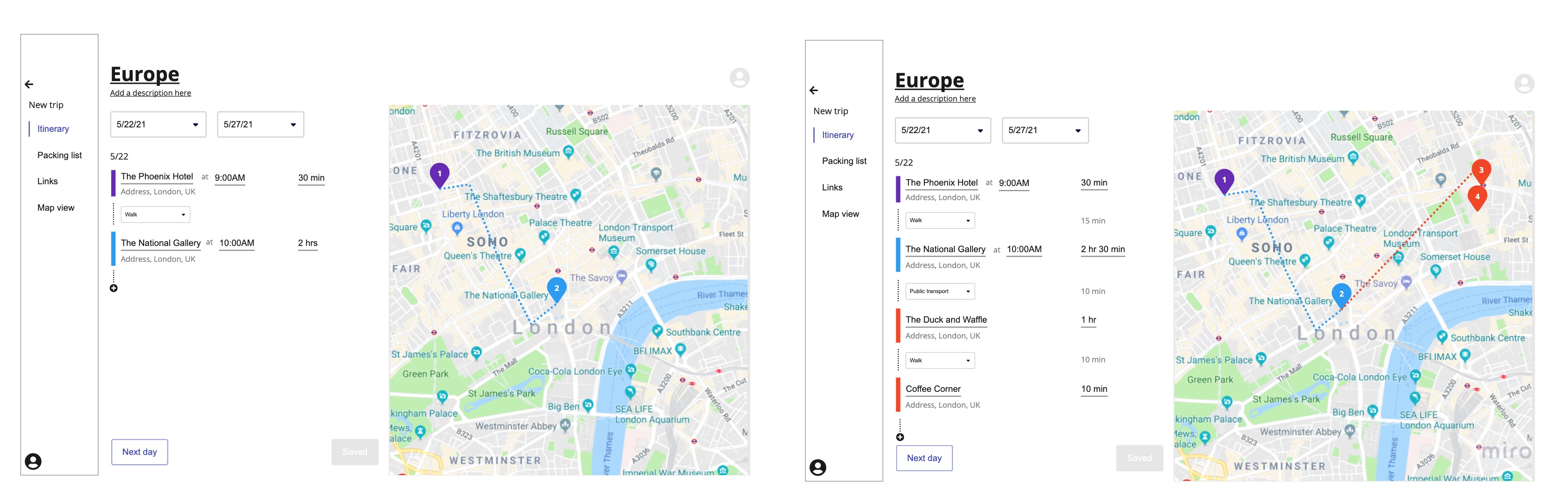
The colors next to each stop mean to communicate the type of stop it is: purple for lodging/hotels, blue for musuems, and red for food.
The colors of the Google Map pins also represent the type of stop, and would utilize the available capabilities of the API. Transportation modes the user can choose from to get from stop to stop would also be similarly pulled.
While the user would be able to enter the duration and when they wanted to be at a stop, the app would help reduce mental load by calculating the travel time for users.

The side menu (collapsible) aims to let users quickly navigate from itinerary planning to the packing list. It also has the potential to hold more features, shown here as ‘Links’ and ‘Map View’ – a potential to store all links to tickets/passes, and a robust visual guide of the itinerary.
Days are stored in accordions so the user can utilize more space to do planning; I wanted to minimize tedious scrolling as much as possible.

Mobile (Coming Soon)