Karpuul
3 months | Sketch, Adobe IllustratorThe very first product I worked end-to-end on was a student carpooling app.
For a semester, my team of 5 built a mock product, culminating in a 30 minute long business pitch to professors and industry professionals.
While I ran interviews and usability studies when needed, my primary focus was the UI and visual design.
For a semester, my team of 5 built a mock product, culminating in a 30 minute long business pitch to professors and industry professionals.
While I ran interviews and usability studies when needed, my primary focus was the UI and visual design.
Research
As winter break approached, Tufts students were posting on Facebook to organize carpooling and other group travel methods in order to save money. It became apparent that taking the train or bus was expensive and financially stressful for many. The team thought a possible solution was to organize carpooling collectively, to allow drivers and riders to save costs.
To validate our assumptions, we conducted 5 preliminary informational interviews, asking questions about current travel habits, pain points of finding a carpooling option, and what preferences they had about carpooling.
Some of the identified user needs and product requirements were:
To validate our assumptions, we conducted 5 preliminary informational interviews, asking questions about current travel habits, pain points of finding a carpooling option, and what preferences they had about carpooling.
Some of the identified user needs and product requirements were:
Needs
- Search for rides based on cities
- Post as a driver looking to 'sell' open seats
- Browse riders’ and drivers’ profile
- Message within the app
- Book a seat
- Toggle personal preferences about rides
Requirements
- Be able to view trips based by time
- Be able to book seats on a specific trip
- Be able to see information about other users on a specific trip
- Have the ability to reject a potential rider
- Be able to clearly view the price for specific trips
Low Fidelity Design
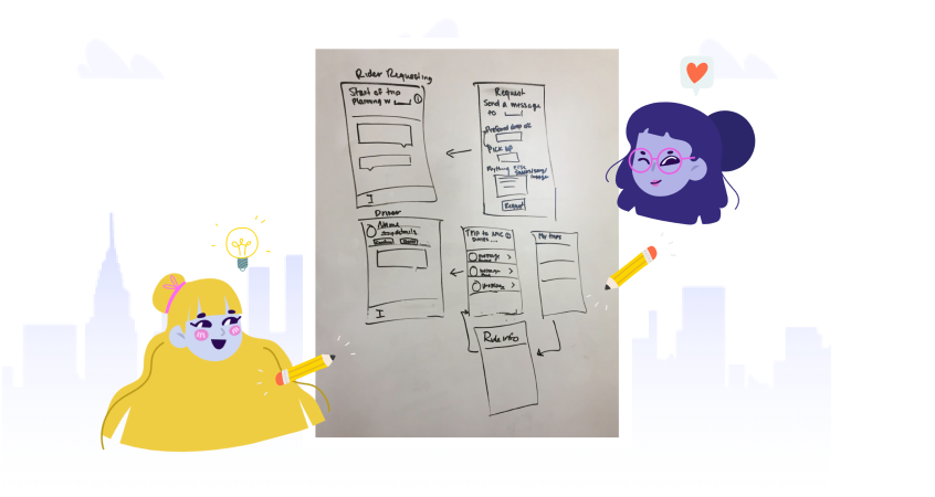
Much of the initial ideation was done on the whiteboard, with the main focus of those design sessions being around how the user would move through the application. In addition, we focused on feature hierarchy of the app – for example, what made sense as primary actions, or to put behind an action menu.
Much of the initial ideation was done on the whiteboard, with the main focus of those design sessions being around how the user would move through the application. In addition, we focused on feature hierarchy of the app – for example, what made sense as primary actions, or to put behind an action menu.


We knew users needed the ability to:
After ideating, we used Balsamiq to spin up wireframes quickly.
- Estimate and split gas costs
- Manage user profiles (name, school, picture)
- As a driver, be able to post trips and connect with searching riders
- As a driver, decide radius of drop-off/pickup area
- Connect to social media in order to see mutual friends or acquaintances
- Send in-app messages.
After ideating, we used Balsamiq to spin up wireframes quickly.

High Fidelity Design
We conducted two rounds of usability tests between the low-fidelity wires and the final version. It helped clarify whether users understood the design decisions we had made (e.g. the meaning of badge colors, icons, and filtering options)
We conducted two rounds of usability tests between the low-fidelity wires and the final version. It helped clarify whether users understood the design decisions we had made (e.g. the meaning of badge colors, icons, and filtering options)

Much of the high fidelity design choices regarding components, colors, and icons were made in person, as we sat together in Sketch. Once the general guidelines were established, we split the screens to divide and conquer. A site map made it easier to keep track of the screens needed.
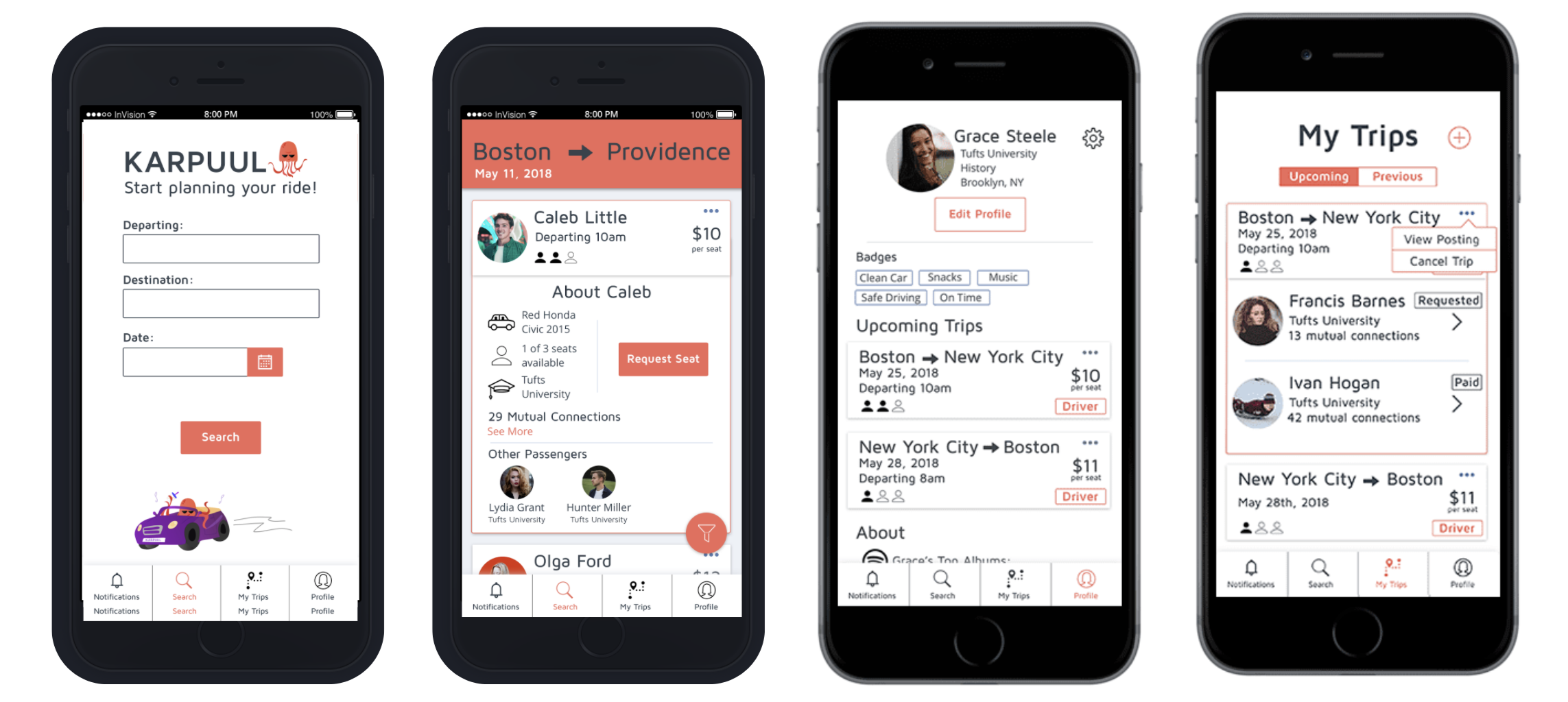

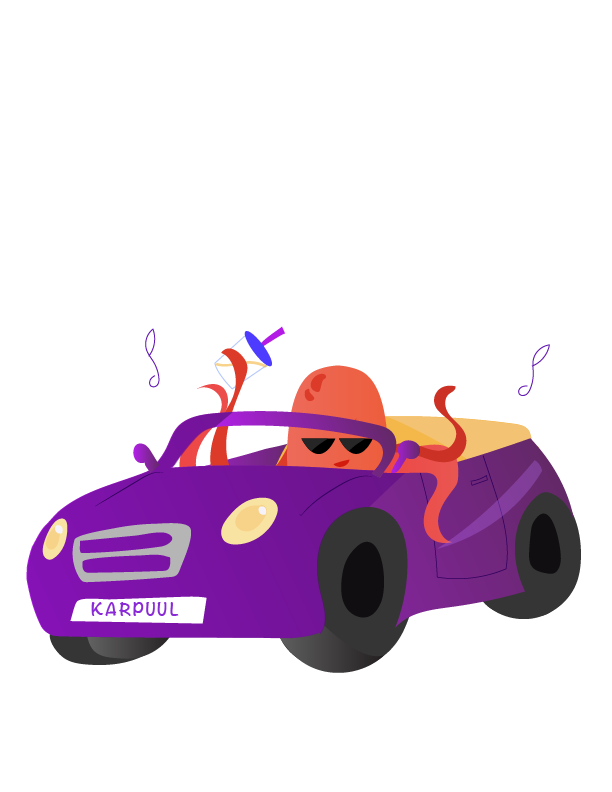
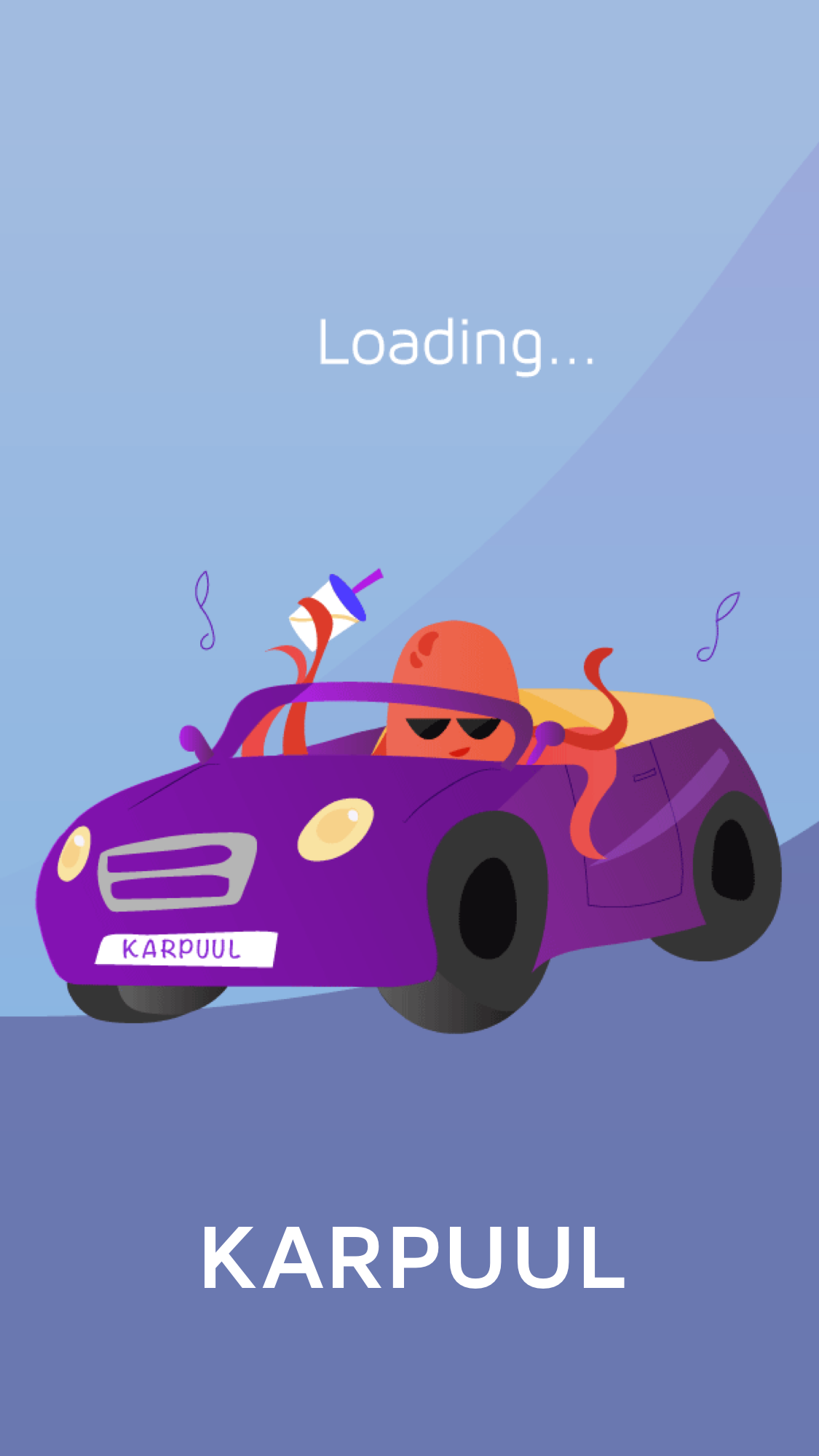
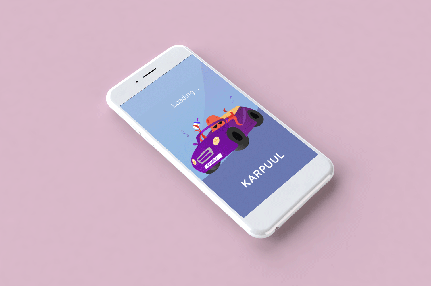
To make the design more delightful, I created a mascot in Adobe Illustrator. The illustrations were used in the loading pages and error screens, so transitions between states would be more fluid for the user.